Bonus Bakery: Website Evaluation and Redesign
Creating a robust online experience to streamline orders through a single platform.
OVERVIEW
Timeline
6 weeks (Nov - Dec 2022)
Team
Isabelle Louie, Sarah Daniels, Rishabh Johri, Naod Asaye
Toolkit
Figma, Zoom, SurveyMonkey
Role
As a UX Researcher, I conducted heuristic evaluations, usability testing, and affinity diagramming to identify customers' needs and pain points, which were then addressed in the website redesign.
Deliverables
The final deliverables included a prototype of the redesigned website, a client report, and a client presentation.
Status
Bonus Bakery has implemented several of our recommendations and all orders are now streamlined through the website.
INTRODUCTION
Context
This project was completed as part of a senior level design evaluation course at Simon Fraser University. The objective was to conduct a thorough design evaluation of a local business' products or services and present our research findings and recommendations.
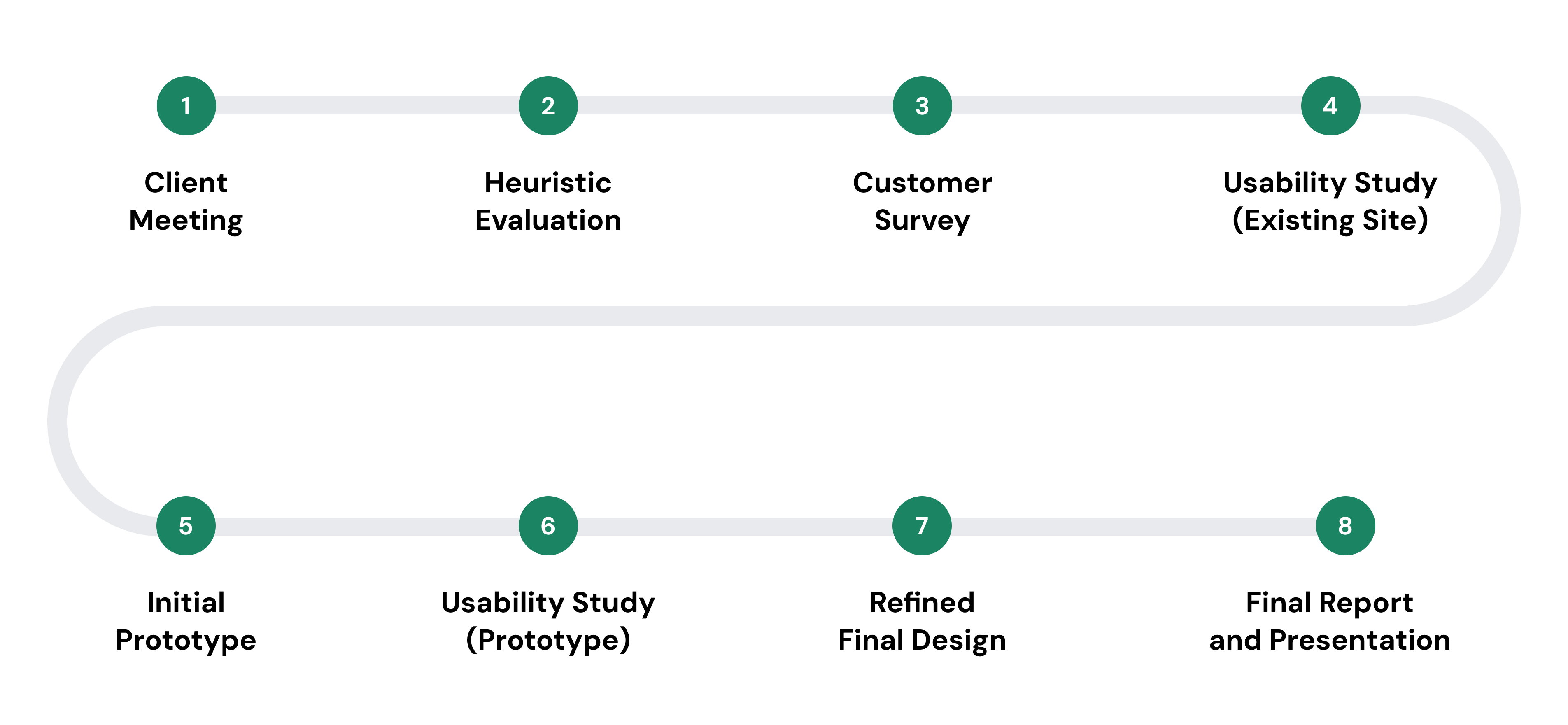
Process Overview
STARTING POINT
The Client
Bonus Bakery, a plant-based bakery in Vancouver, BC.
Founded in 2019, Bonus Bakery quickly established a strong reputation within the local plant-based community. During the pandemic, in-store traffic and sales plummeted, forcing Bonus Bakery to pivot to an online strategy. Although our client initially used multiple channels to communicate information and drive sales, they eventually created a website to keep up with the increasing volume of orders.
The Challenge
Managing multiple ordering channels creates extra work and stress for a small business owner.
Our client explained that orders currently came from various channels, including their website, Instagram messages, text messages, and recurring wholesale orders.
These channels required the owner to manually enter data into a spreadsheet, send order information to their bakers and delivery drivers, and send order confirmation messages to customers.
The Opportunity
How might we create a robust online experience to streamline orders through a single platform?
With the multi-channel strategy hindering the company's scalability due to its reliance on manual processes, our client expressed an interest in streamlining orders through the website.
However, our client had been receiving complaints that customers were facing multiple issues with the site, interferring with their ability to place orders.
To better understand customers' pain points, our team decided to evaluate the design and structure of the website's online ordering process to identify sources of friction and areas for improvement.
The Plan
Our team used three methods to assess the website: heuristic evaluations, an online customer feedback survey, and think-aloud usability studies.
This provided insight from three perspectives: current Bonus Bakery customers, prospective customers who had never interacted with the company before, and our team of designers.
This approach allowed our team to pinpoint critical usability issues, common pain points, and deeply understand customers' ordering behaviors and preferences. Based on our research, our team then developed a list of recommendations and created a high-fidelity prototype of a new design that would better address customers’ needs.
RESEARCH METHODS
Heuristic Evaluation
Applying Jakob Nielsen’s 10 interaction design principles.
Guided by Jakob Nielsen’s principles, I conducted a heuristic evaluation of the Bonus Bakery website, focusing on the process of ordering a single product for delivery and in-store pickup. My complete heuristic evaluation report can be found here.
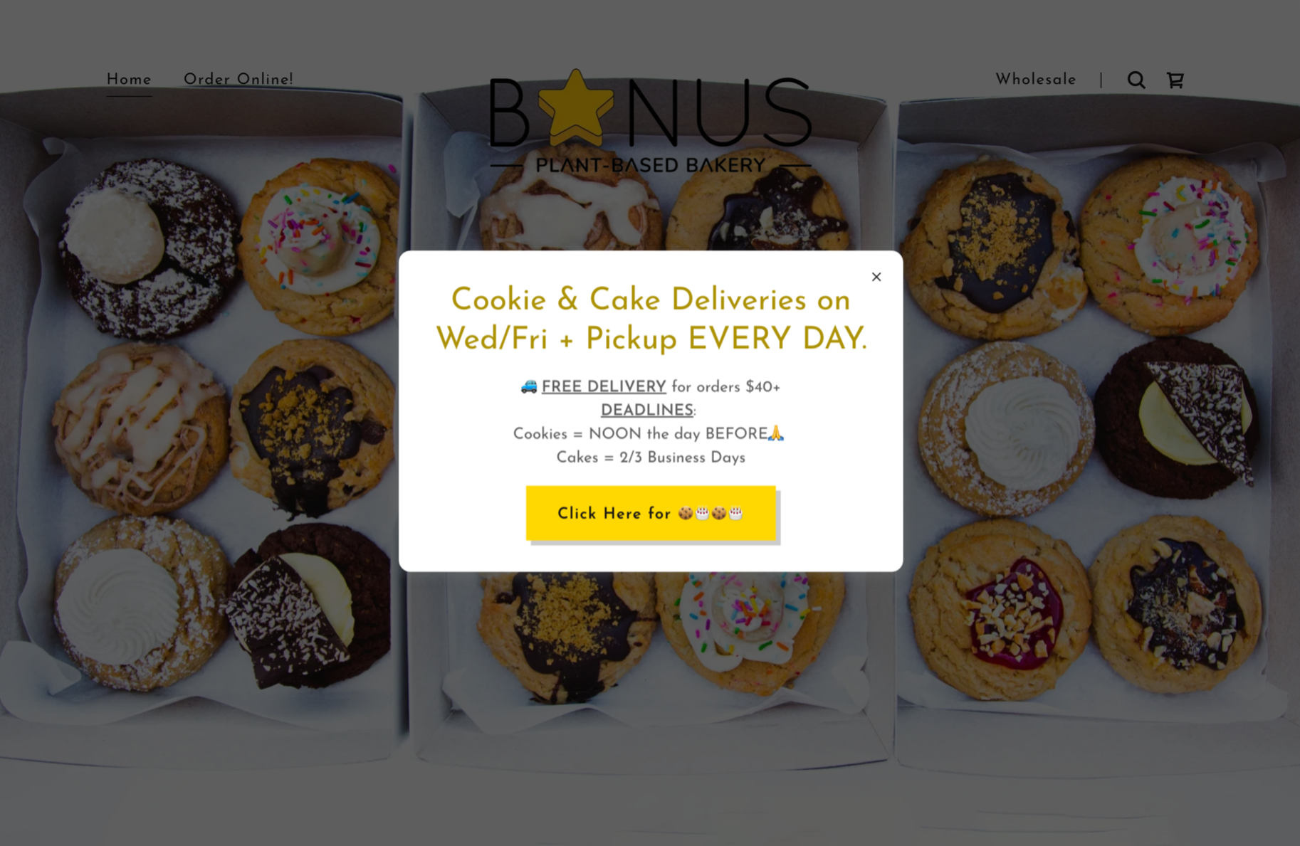
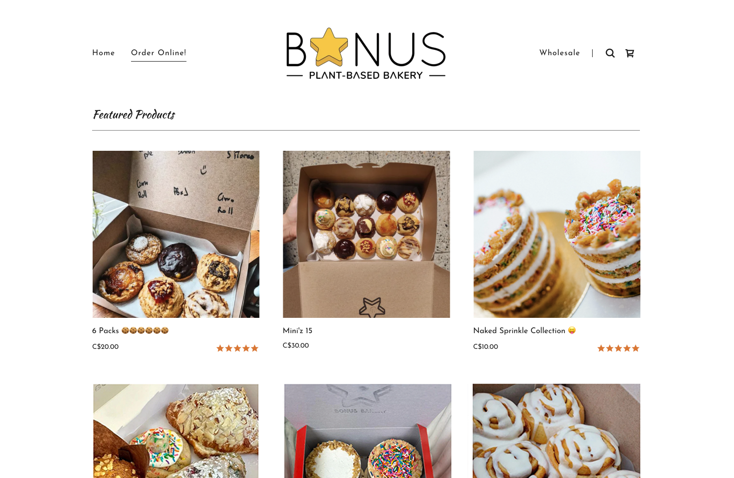
Walkthrough of the existing Bonus Bakery's website
KEY ISSUE #1
Order deadlines are not clearly communicated.
Customers must rely on their memory of the order deadlines from the home page pop up when selecting a delivery date.
KEY ISSUE #2
Lack of error prevention when selecting a delivery date.
Users are able to place orders even after the daily deadline has passed, which can lead to late deliveries or cancellations without the users realizing.
KEY ISSUE #3
Flavour selection process is old-school and overcomplicated.
Users need to manually type their selected flavours in a text box, with no data validation, increasing the risk of user error when placing orders.
Customer Survey
Collecting qualitative feedback from existing customers.
To supplement our findings from the heuristic evaluation, our team conducted an online customer survey to gather qualitative feedback on the ordering process from Bonus Bakery’s existing customers. 49 respondents were recruited through Bonus Bakery's Instagram and Facebook pages.
SURVEY INSIGHT #1
50% of respondents were either indifferent towards or did not like the pop-up presentation of the order deadline information.
SURVEY INSIGHT #2
60% of respondents suggested improvements to the flavour selection process.
Usability Testing: Existing Website
Conducting usability studies to understand customer behaviour
To gain a deeper understanding of customers’ interactions with the website, our team conducted four think-aloud usability studies on the existing website. I conducted tests with two participants: one current and one prospective customer.
Participants were given three tasks and asked to describe their thoughts out loud as they completed them. Each task required participants to identify a product that fulfilled the needs of a given scenario and to go through the ordering process until they reached the checkout page.
Our team then conducted affinity diagramming to organize the qualitative data collected, with four common issues emerging.
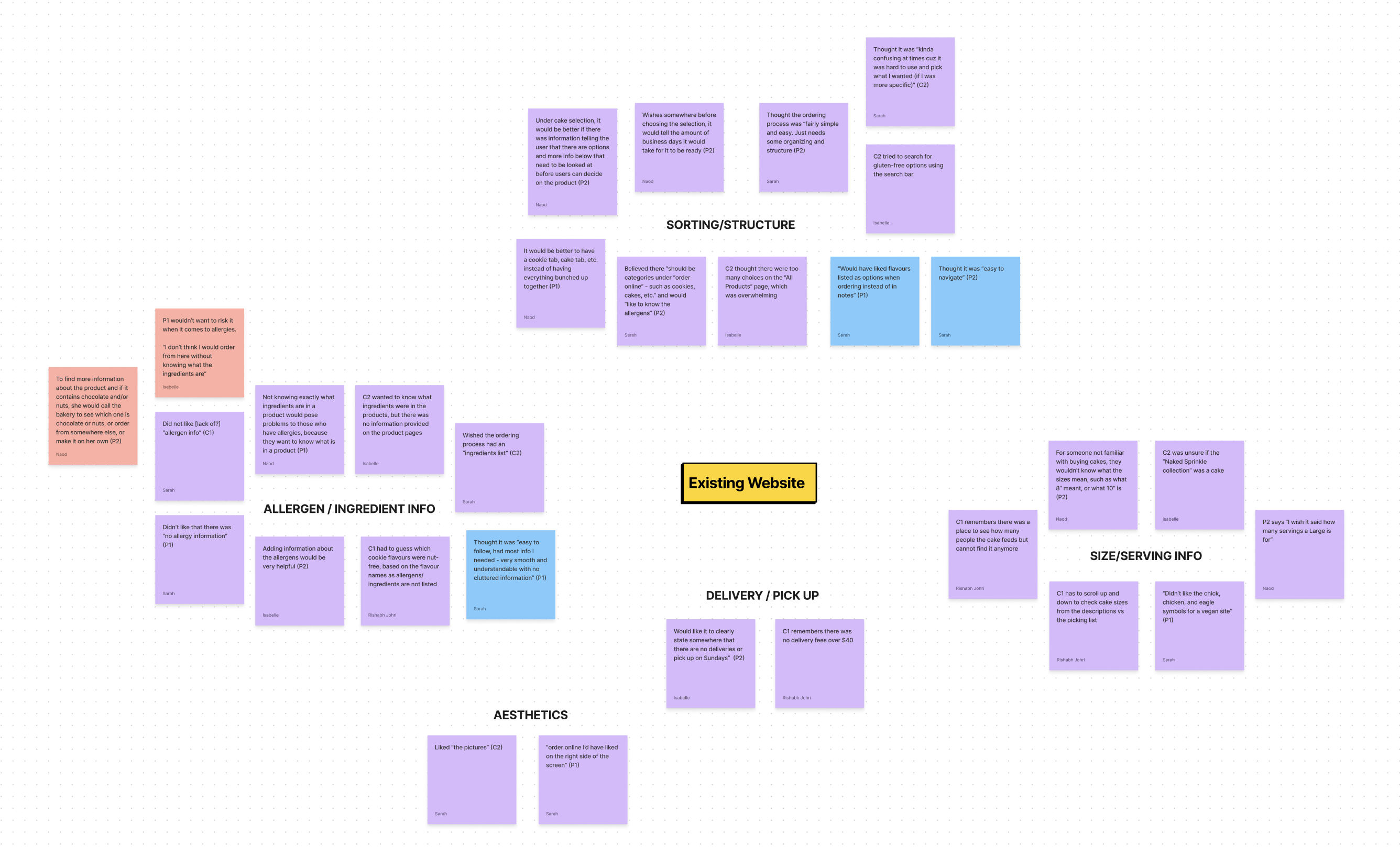
Affinity diagram for the existing website usability study
STUDY INSIGHT #1
Order deadline and delivery information is easily forgotten.
STUDY INSIGHT #2
Ingredient transparency is crucial for those with allergies.
STUDY INSIGHT #3
The inability to sort results creates information overload, making it difficult for users to find the products they want.
STUDY INSIGHT #4
Inconsistent information is displayed across pages. For example, some product pages contain serving size information while others do not.
📌 Personal Takeaways
Silence is golden (for the researcher, not the participant).
One challenging aspect of conducting usability tests was resisting the urge to help the participant if they ever got stuck. However, I noticed that letting participants struggle on their own allowed for richer insights into their mental models and expectations, especially when thinking aloud.
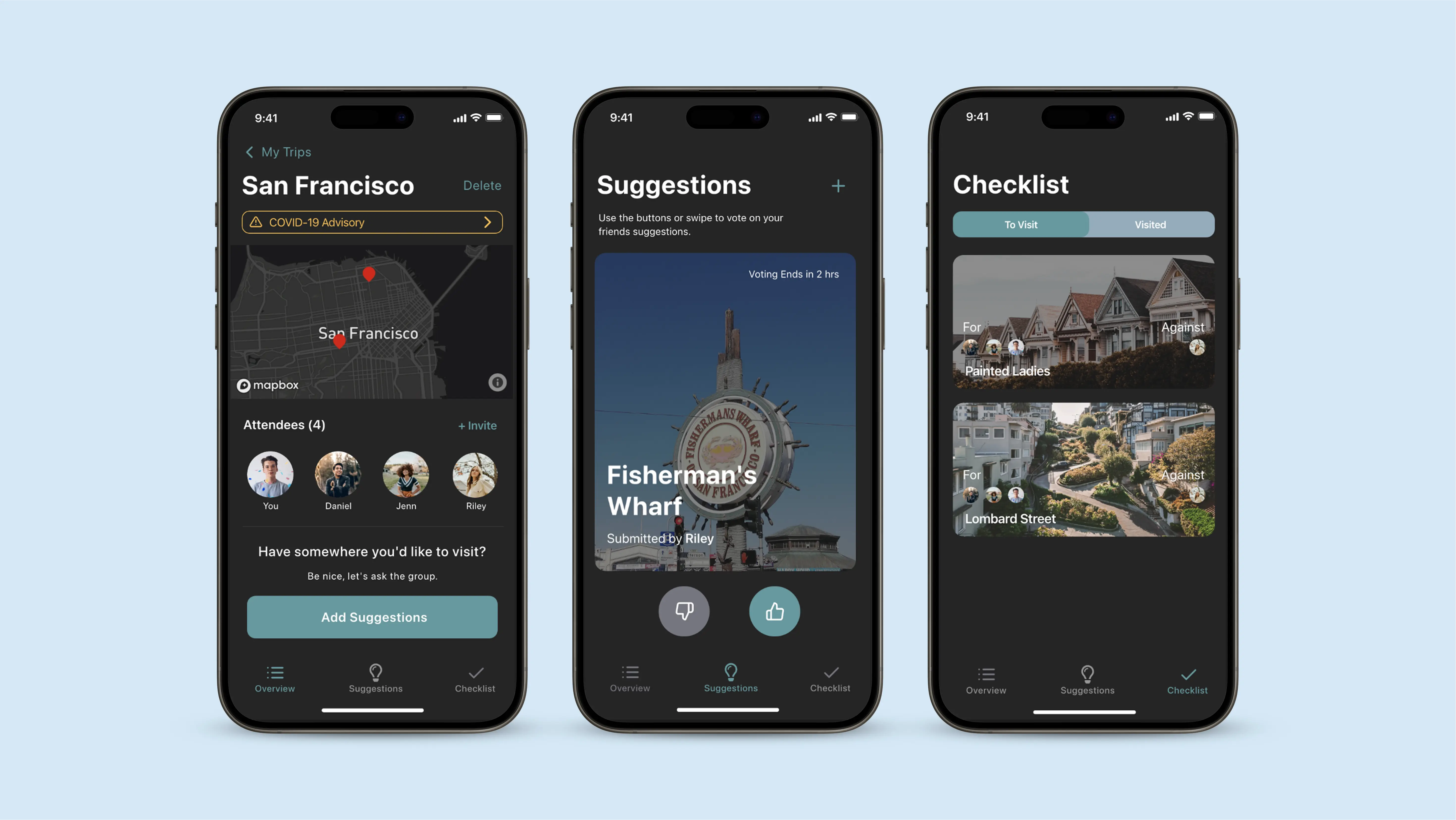
PROTOTYPING
Initial Prototype
Transforming research findings into a tangible solution.
Based on the findings from the heuristic evaluation, customer survey, and usability studies, our team created the first iteration of an interactive prototype with recommended changes. I was responsible for designing interactions, writing microcopy, and adding functionality to user flows.
KEY CHANGE #1
Static cards on the homepage with delivery and deadline information
Bonus Bakery's previous home page pop-up
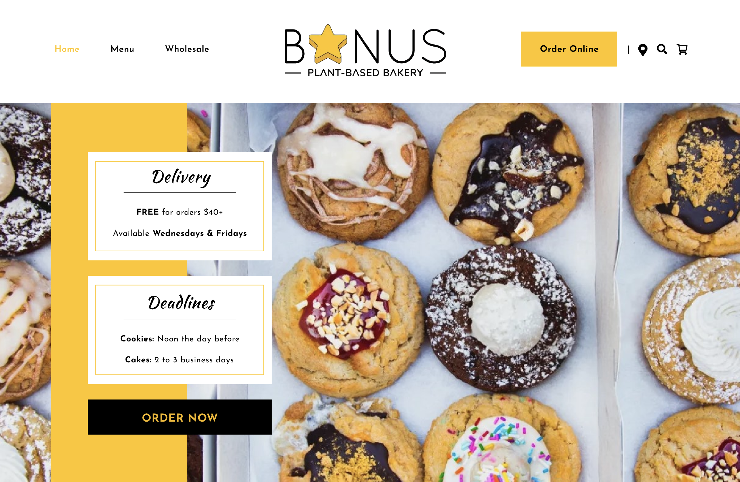
Bonus Bakery's redesigned home page
KEY CHANGE #2
Product filters on the All Products page
Previous All Products page
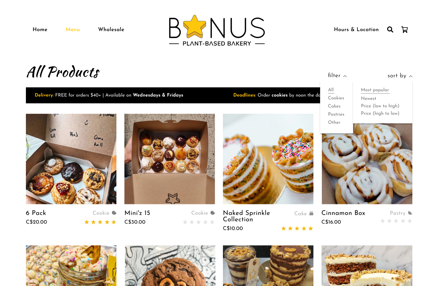
Redesigned All Products page with product filters
KEY CHANGE #3
Revamped product pages with additional photos and information
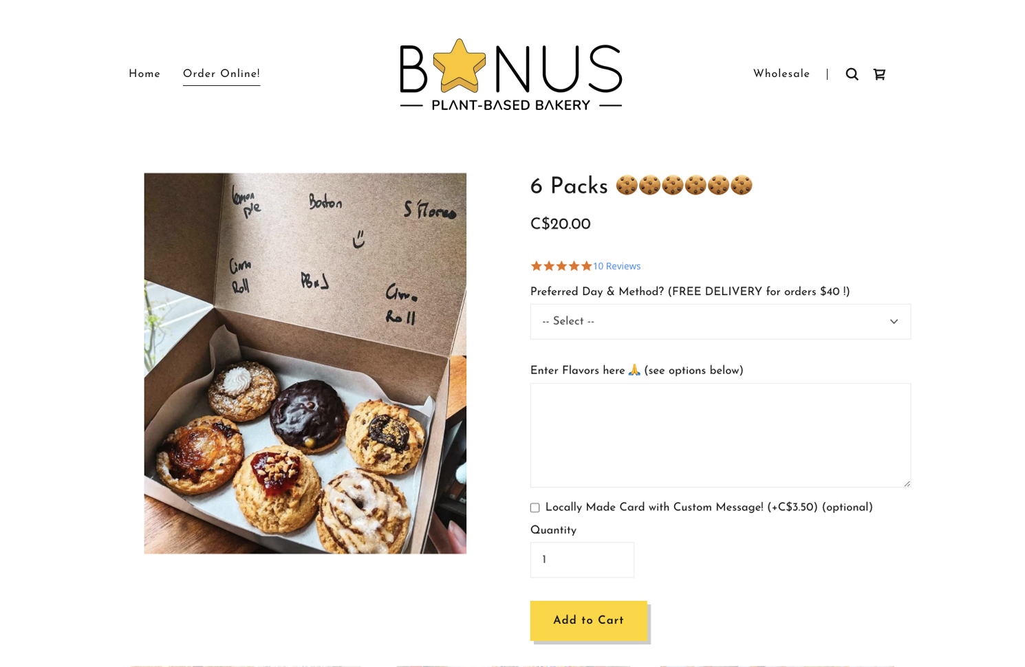
Previous product page with textbox entry
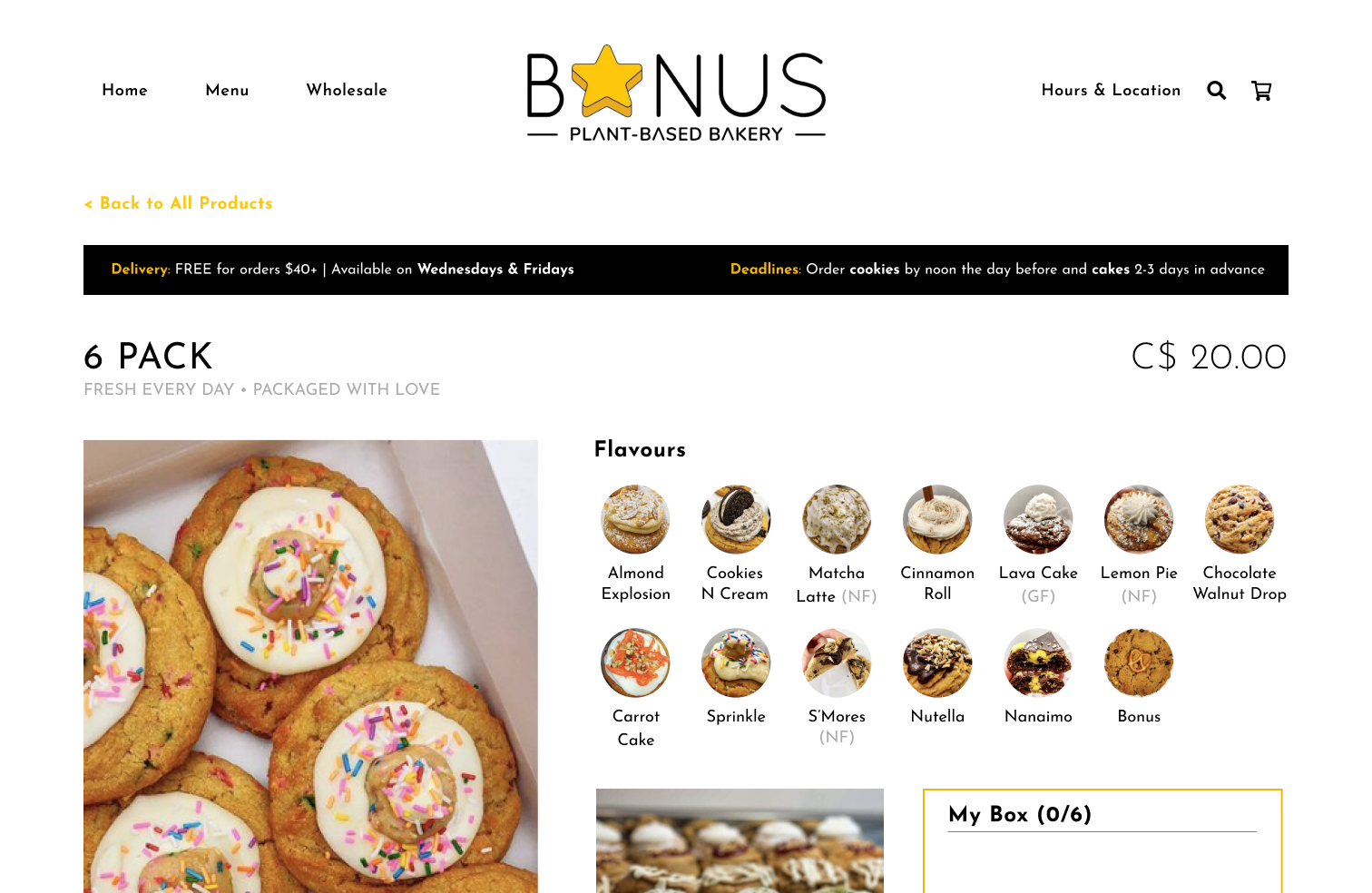
Redesigned page with simplified flavour selection
KEY CHANGE #4
Delivery selection moved to checkout page, with added data validation
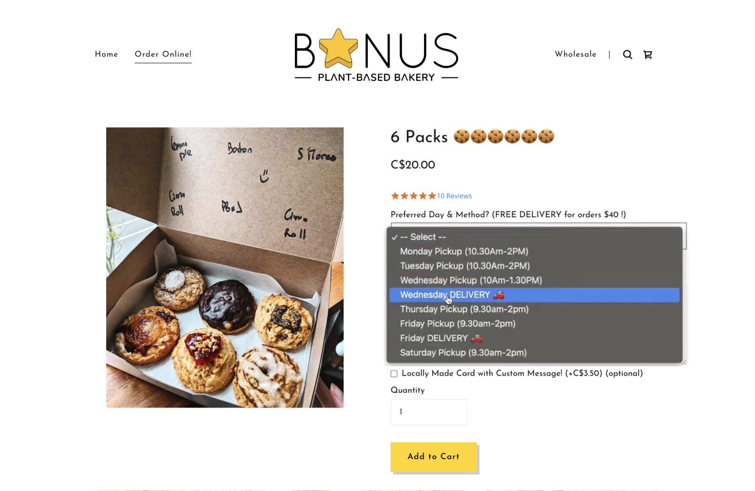
Previous delivery date selection process
Redesigned delivery selection with available dates only
TESTING
Usability Testing: Prototype
Evaluating our recommendations through user testing.
Using this prototype, our team conducted eight think-aloud usability studies with current and prospective customers, with a process similar to the first round of studies conducted on the existing website. I led four sessions: two with current customers and two with prospective customers.
Participants were given three tasks and asked to describe their thoughts out loud as they completed them. Each task required participants to identify a product that fulfilled the needs of a given scenario and to go through the ordering process until they reached the checkout page.
Affinity diagramming revealed strong support for our recommendations.
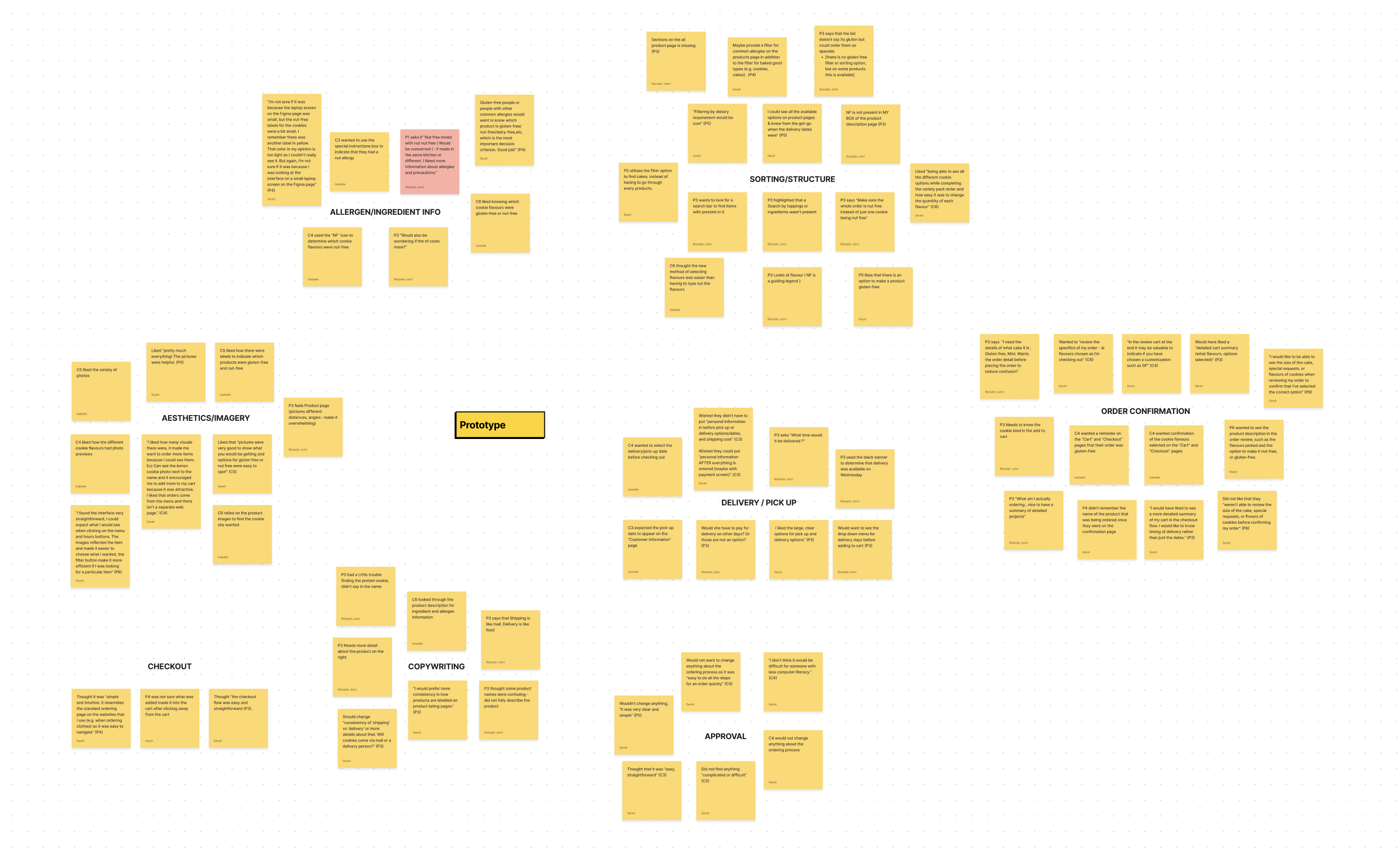
Affinity diagram for the prototype usability study
Participants liked the addition of ingredient information, filter and sorting options, and simplified delivery selection process.
"I could see all the available options and knew from the get-go when the delivery dates were."
- Participant 7, Prospective Customer
"I found the interface very straightforward. The images reflected the items and made it easier to choose what i wanted, and the filter button make it more efficient if I was looking for a particular item."
– Participant 6, Prospective Customer
One common suggestion was to provide a more detailed order review prior to checkout.
"I would like to be able to see the size of the cake, special requests, or flavours of cookies when reviewing my order to confirm that I’ve selected the correct option"
– Participant 6, Prospective Customer
"In the review cart at the end it may be valuable to indicate if you have chosen a customization such as gluten-free."
– Participant 5, Current Customer
📌 Personal Takeaways
Virtual usability testing can create unforeseen challenges.
Despite conducting a pilot study to sort out any bugs before testing with real customers, we still ran into a few technical difficulties. For example, one participant joined the study using a touchscreen Chromebook, which completely broke the Figma prototype on their device. This was an interesting insight, and for future virtual tests I will be sure to specify the type of device required for the study in the participant screening survey.
REFINING
Prototype Refinement
Finalizing our design based on user feedback.
Based on the feedback collected during the usability study with the prototype, our team made a few minor changes to refine and finalize the design.
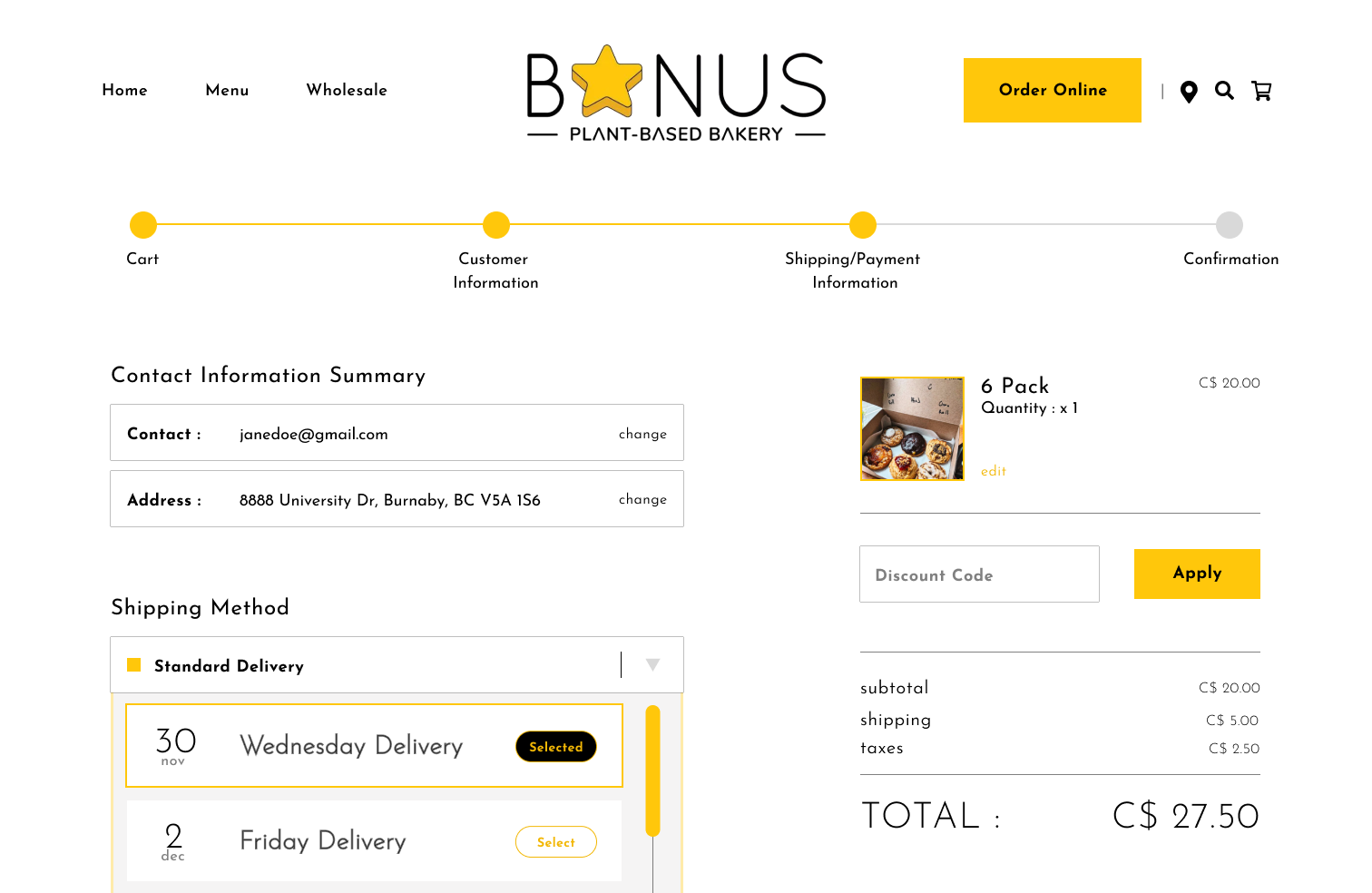
KEY CHANGE #1
Delivery selection moved to checkout page, with added data validation
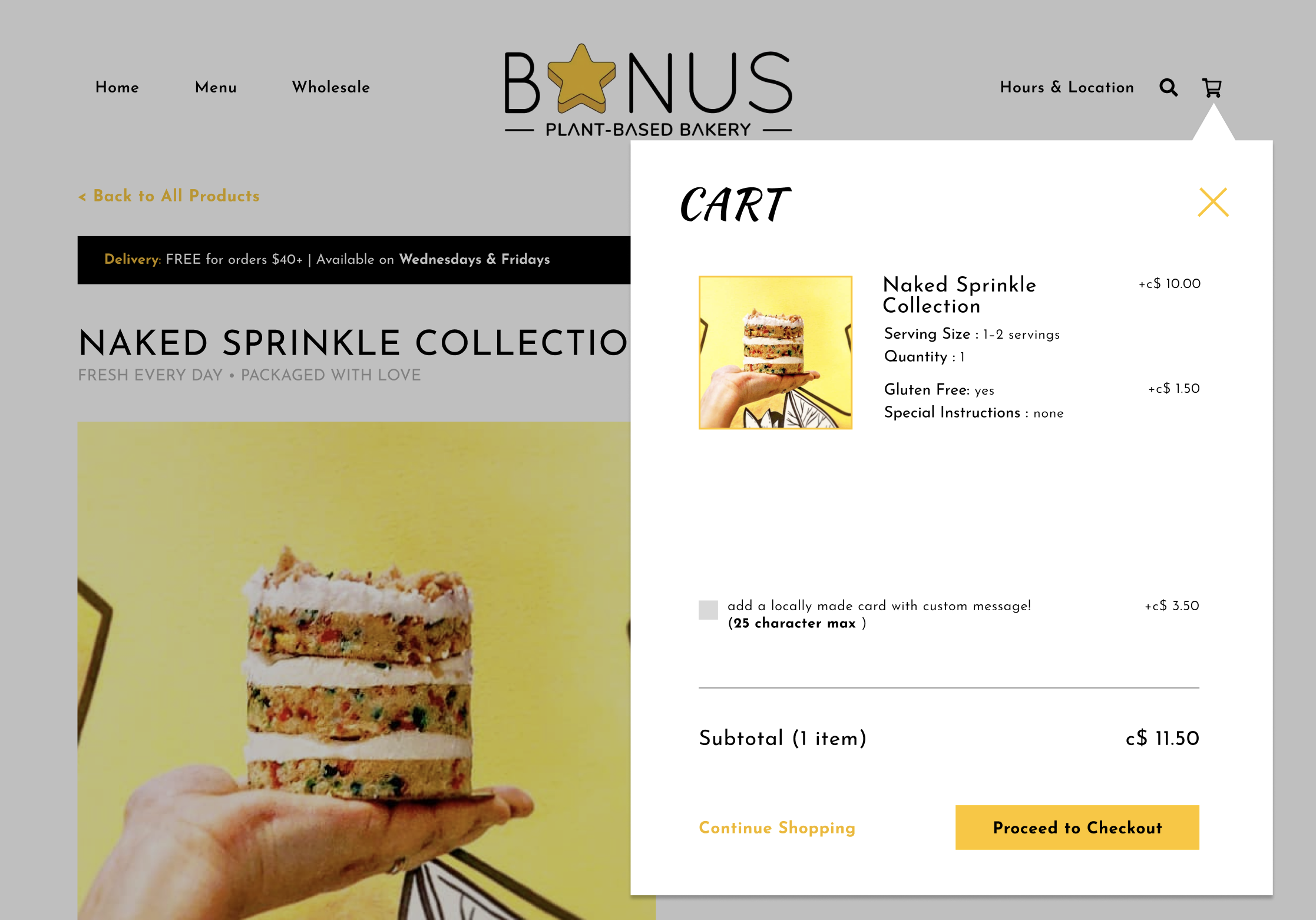
Refined order summary in Cart
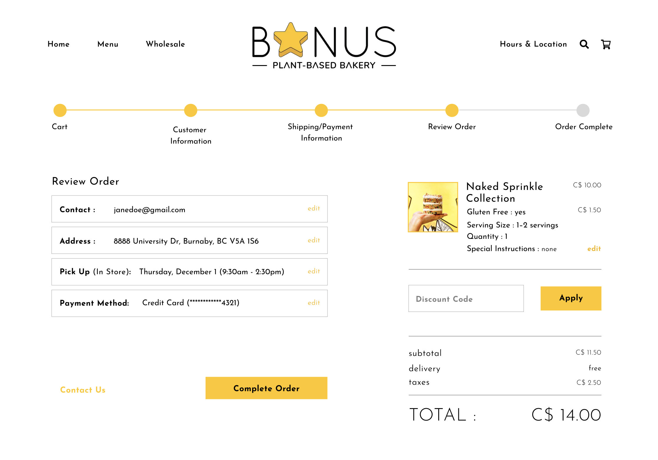
Refined order summary in Order Review
FINAL PROTOTYPE
Experience the Final Design
CONCLUSION
Final Takeaways
Usability testing is key to understanding the customer journey, and it might be my new favourite skill.
This project provided an excellent opportunity to delve into various UX research methods, with a particular emphasis on developing my skills in designing and conducting usability studies.
Although the online customer feedback survey allowed our team to collect a large number of responses in a short amount of time, I appreciated how the usability studies offered richer and more nuanced insights. By using a think-aloud approach, I also gained deeper insight into users' mental models, feelings, and thought processes, which helped reaffirm my understanding of customers' needs and pain points.
This was the first time I had taken the lead on designing and conducting usability studies, and I thoroughly enjoyed the process. From recruiting participants and scheduling sessions to gaining confidence in leading sessions with complete strangers, this project was a tremendous learning opportunity and sparked a newfound passion for UX research.