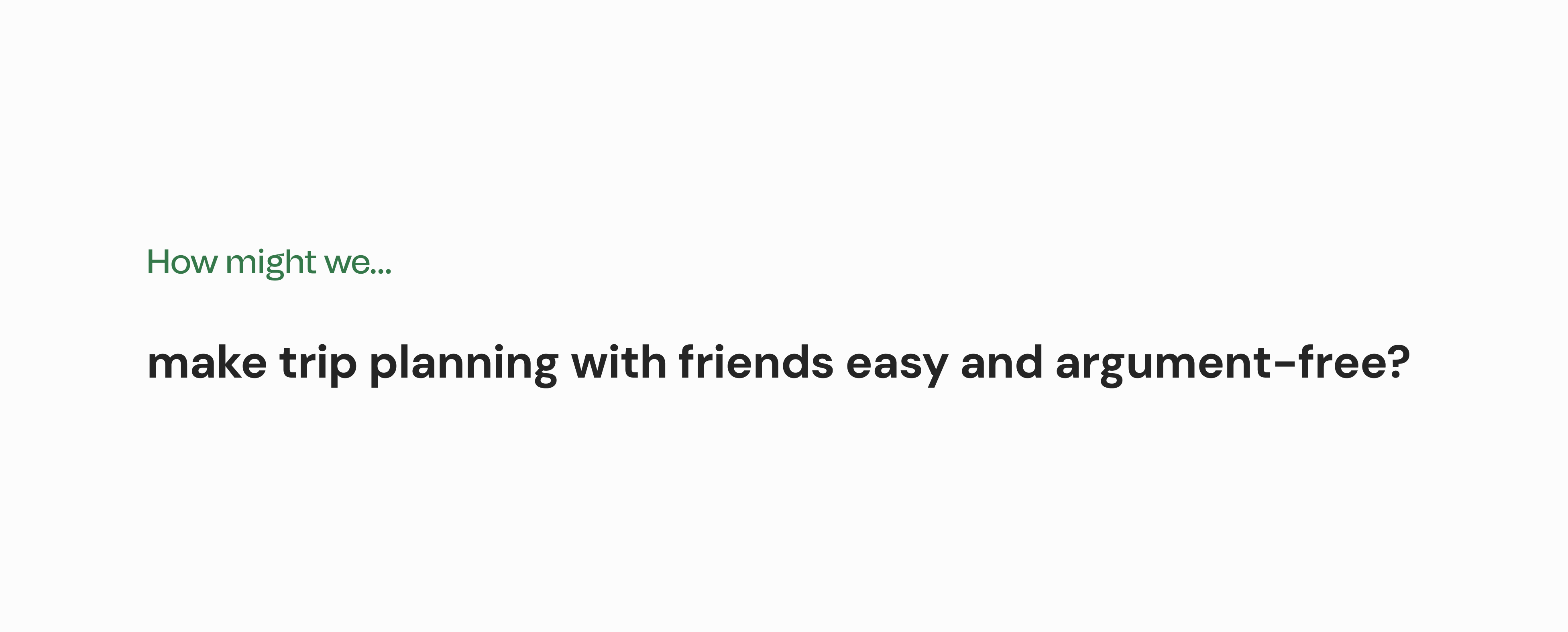
TripCollab
A mobile app designed to make group trip planning easy and argument-free, where friends can suggest, vote, and decide on places to visit.
OVERVIEW
Timeline
7 weeks (Oct - Dec 2020)
Team
3 UX Designers
Toolkit
Figma, Framer, Illustrator, Photoshop
Role
As a UX Researcher and Product Designer, I conducted user interviews and usability tests; created wireframes, user flows, and prototypes; and developed a product website to highlight the key features of our application.
Deliverables
The final deliverables included a prototype of the conceptual mobile application and a product website.
INTRODUCTION
Context
This project was completed as part of a senior level user interface design course at Simon Fraser University. The objective was to select a target design domain, conduct user research to identify their common goals and activities, and design a unique mobile application to address their needs.
Process Overview

STARTING POINT
Target Audience
Focusing on business travellers.
Our first step was to establish a target audience, understand the challenges they face, and brainstorm potential design directions. We decided to focus on business travelers who want to maximize their time on business trips while maintaining a work-life balance.
Initial Research
Understanding user needs through interviews and secondary research.
Our team conducted user interviews and secondary research to better understand the behaviours, needs, and pain points of our target audience. Individually, I led 1 user interview and consolidated research findings into a user persona.
"My main goal is to maximize the time spent with clients, so my free time would depend on my clients’ schedule."
– Participant 1, Senior Systems Analyst
80% of corporate travelers make sure to squeeze in fun activities while on a business trip.
(National Car Rental, 2018)
IDEATION
Concept Proposal
Logistical.ly, a trip planning app for business travellers.
Based on our research, each team member generated one idea for an app that would address our audience's needs while considering the project requirements of incorporating a functional sensor/API.
My proposed concept was Logistical.ly, a trip planning app designed to help users maximize time spent with clients by suggesting optimal venues to minimize travel time between locations.

Initial wireframe sketches of my concept, Logistical.ly
Wireframing
Mapping out user interactions and sketching layout ideas.
My concept was chosen as our team's primary design direction, to create an app that provides trip planning and suggestions all in one place. The next step was to elaborate on my initial user flow by mapping out key interactions and incorporating the Google Maps API. This refined concept would provide our persona with the ability to plan trips with ease and generate an itinerary that she could share with her colleagues.

Wireframe sketches of the user interaction flow. The top row of sketches are my own
REFRAMING THE PROBLEM SPACE
Are we on the right track?
Reframing the concept for a new demographic.
Based on the critique we received on these wireframes, our team realized that the direction we had chosen was already entrenched in the market, with several existing applications addressing the same goals with similar features. The feedback highlighted a need for differentiation, so we set out to redefine what Logistical.ly could offer for a different demographic.
Drawing from our own experiences and conversations with our peers, our refined idea focused on providing a collaborative platform to plan trips with friends, where users can add suggestions for places to visit and vote on suggested locations so every member of the group can share their input.
📌 Personal Takeaways
Thank god for sketching and wireframing first!
It was at this moment that I realized how much time sketching and wireframing can save in the design process. By using low-fidelity representations of our ideas as the basis for initial feedback, this allowed our team to pivot to a new direction much more seamlessly and with less time wasted.
Shifting Focus
We shifted our target audience to leisure travellers, specifically young adults ages 18-24, who enjoy travelling with groups of friends.
Our team returned to the research stage to explore the needs and pain points of this new target audience through additional secondary research and informal interviews with peers.
"It's so frustrating how we always spend ages planning these things because no one can agree on what to do."
- Interview Participant, University Student
67% have argued with a travel companion as a result of stress caused by planning or taking a vacation.
(Wyndham Vacation Rentals, 2017)
41% get stressed about scheduling things to do during their trip.
(Wyndham Vacation Rentals, 2017)
A NEW DIRECTION
The Design Opportunity
Based on second round of research, our team came up with the following design focus:
WIREFRAMING
Wireframing: Second Iteration
Reshaping user flows to address the needs of our new target audience.
Since we had to refocus the direction of our application, we also needed to reshape our user flow, so each team member created their own user flow design based on a unifying style guide.

Wireframes of three new user flow concepts. The middle row of wireframes are my own.
PROTOTYPING
Initial Prototype
Consolidating the best aspects of each team member's designs into one cohesive interface.
This prototype featured a fully fleshed out user flow, a refined interface design, microinteractions for specific actions, and the integrated use of the Maps API.
A consolidated design featuring the best aspects of our individual user flow designs
TESTING
Usability Studies
Can users navigate the main flow of the Logistical.ly prototype without friction?
Our team conducted three usability studies over Discord, using screen sharing and a think-aloud technique. Our participants were avid travellers prior to the COVID-19 pandemic, often travelled alongside friends, and had a minimal to moderate budget. Three key insights emerged from our studies:
STUDY INSIGHT #1
Visual cues were not clear enough.
"The map view did not provide useful or relevant information and the visual cue (arrow) to bring up list view was too small and hard to notice." – Participant 1
STUDY INSIGHT #2
A lack of microinteractions leads to confusion over task status.
"I couldn't tell whether my suggestion was added or not." – Participant 2
STUDY INSIGHT #3
Pages need more relevant and descriptive titles.
"Having the map on the checklist tab was confusing and not what I expected." – Participant 2
REFINING
Prototype Revisions
Refining our design based on user feedback.
Based on these findings, we created an improvement plan for our final design, focusing on incorporating clearer visual cues, conveying more feedback through microinteractions, establishing stronger hierarchy within our interface, and providing more context to the our key features through the use of microcopy.
KEY CHANGE #1
Added microcopy to convey purpose and functionality of features

First iteration of the Suggestions page
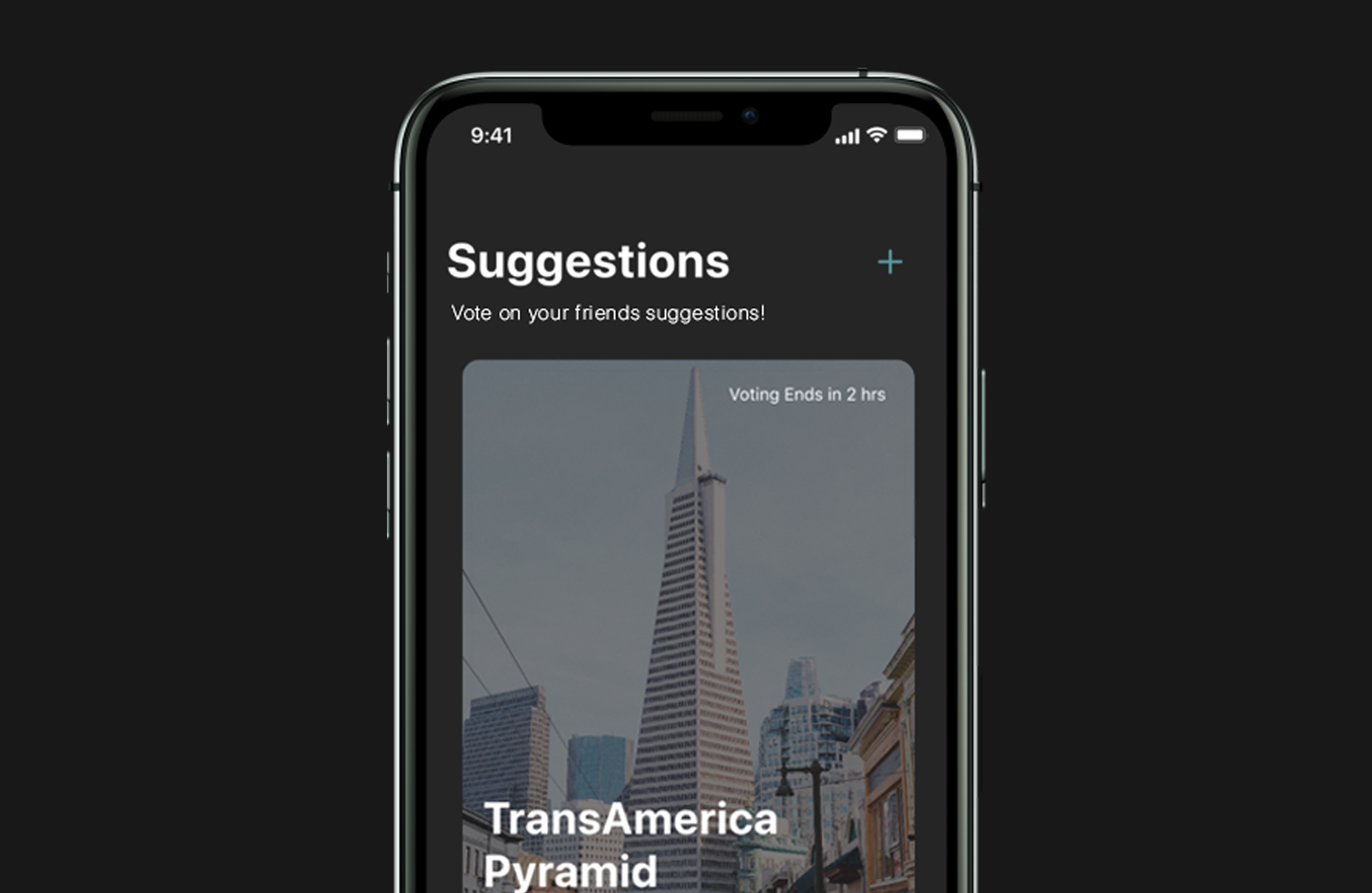
Refined Suggestions page with microcopy
KEY CHANGE #2
Less relevant information is displayed less prominently

The map on the previous Checklist page confused users

The map is now accessible through a location card's detailed view
KEY CHANGE #3
Microinteractions provide instant feedback on user actions

The previous prototype lacked feedback on user actions
Microinteractions now appear once actions are completed
KEY CHANGE #4
More natural and accurate visual cues

First iteration of the Voting page

Refined icons better reflect liking/disliking a suggestion
FINAL DETAILS
Time for a new name...
Evolving from Logistical.ly to TripCollab.
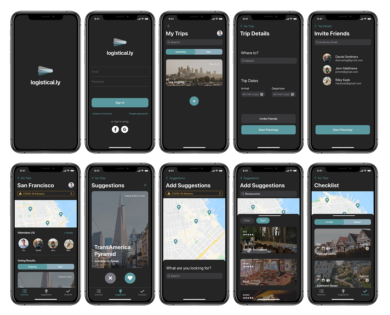
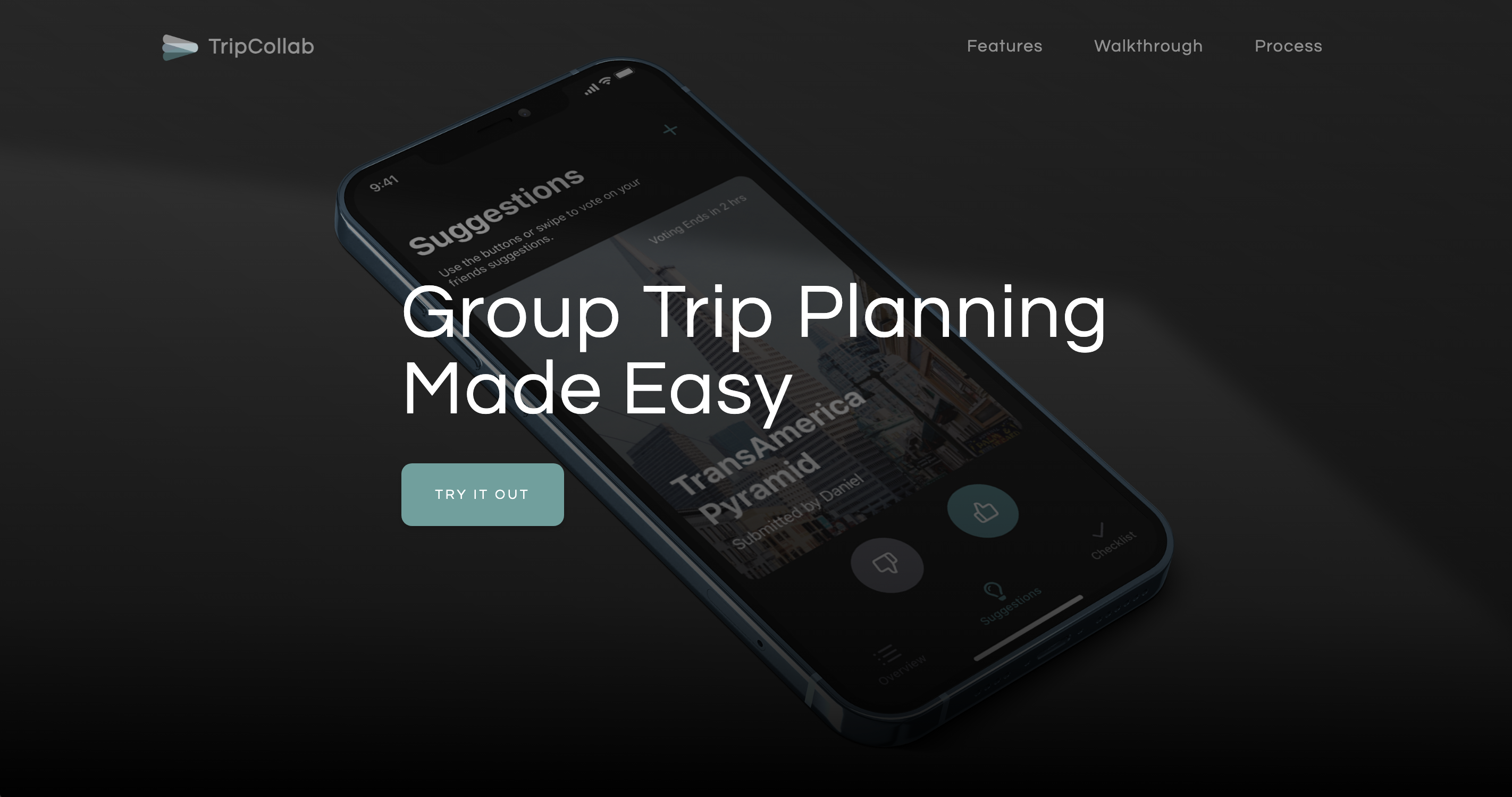
In the final stage of development, we decided to change the name of our application from Logistical.ly to TripCollab to better reflect the purpose of our application, which had evolved over the iterative design process. The end result is a seamless, interactive planning experience that follows the user's journey from the start of the plan until the end of the trip.
PRODUCT WALKTHROUGH
Trip Planning Made Simple
Create a trip or join an existing plan. Invite your friends to collaborate!
Collaborate with Others
Suggest places to visit during your trip and vote on your friends' suggestions.
Keep Track of your Travels
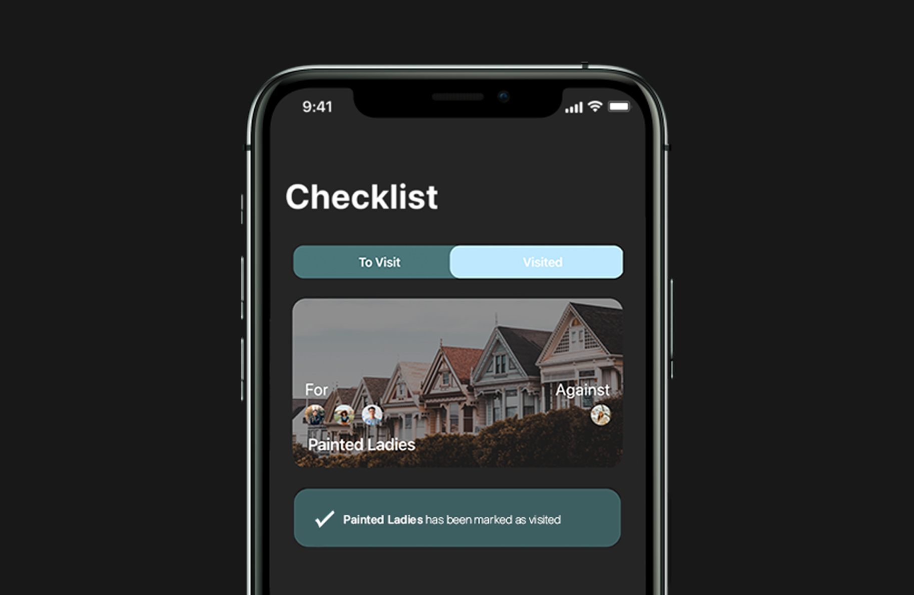
Check off the places you've visited with the built-in checklist.
INTERACTIVE PROTOTYPE
Experience the Final Design
MICROSITE
Product Website
Showcasing key features and use case scenarios.
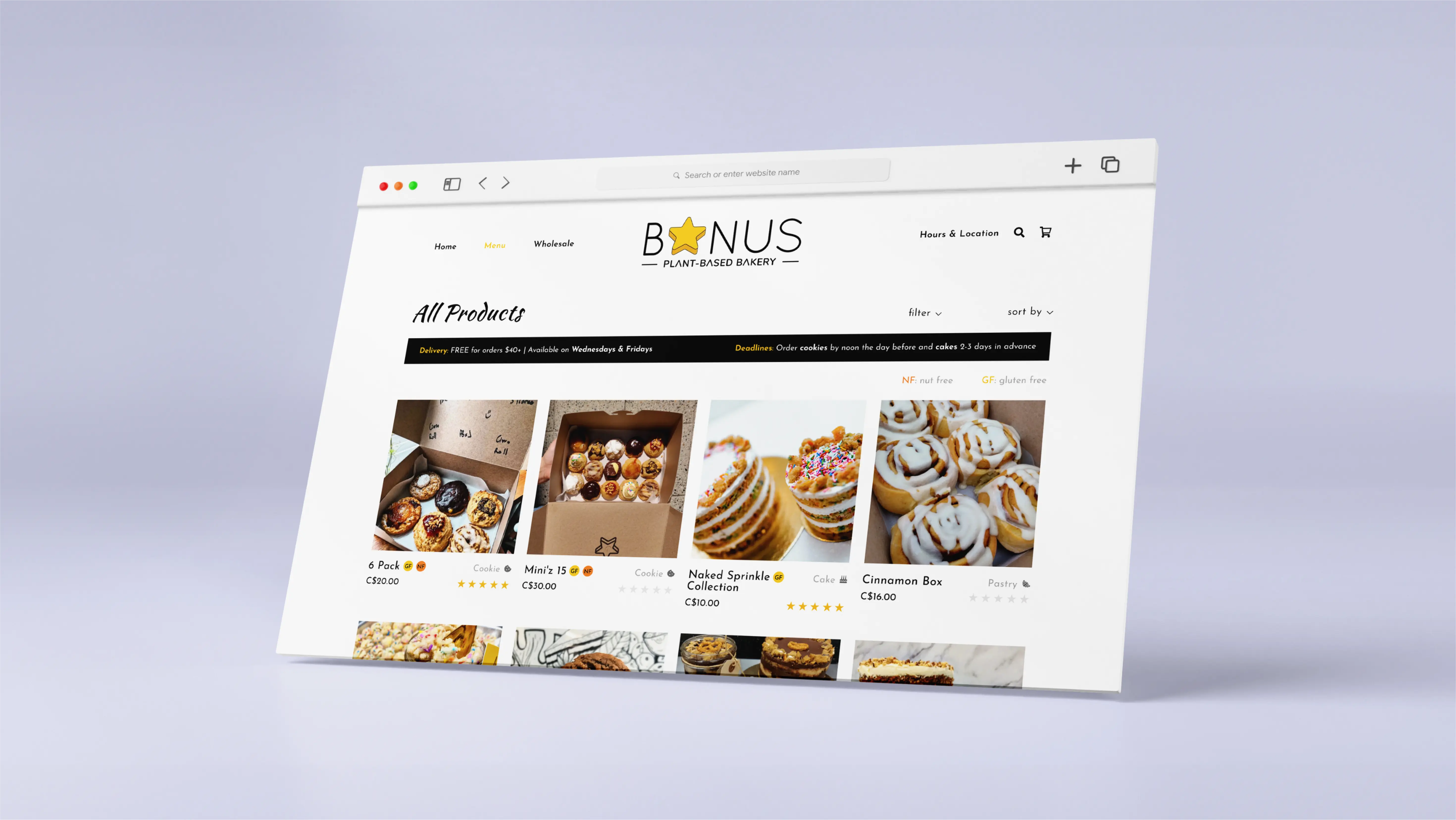
To conclude this project, I created a product website to highlight the key features of our application, showcase the context in which it would be used, and allow users to try out our prototype for themselves.
Final product website for TripCollab
REFLECTION
Final Thoughts
Insights from user research can completely reshape the trajectory of your design.
This project was an eye-opening learning experience, allowing me to bring an idea to life through extensive ideation and research. The challenge of pivoting our design direction based on feedback on our initial proposal highlighted the importance of conducting research early in the design process, and reinforced the significance of incorporating feedback across all stages to ensure alignment with project requirements and user goals.
This group project also provided an opportunity to strengthen my time management, communication, and collaboration skills, as our team was required to present weekly deliverables to showcase the development of our design. Our team excelled in delegating and assigning tasks to members, setting deadlines for individual deliverables, and collaborating efficiently during team meetings to complete our team deliverables well in advance of deadlines.