FLAIR AIRLINES
Simplifying Flight Selection on Mobile
A redesigned flight selection process that enhances information clarity, builds user trust, and drives conversions.
OVERVIEW
Timeline
2 days (February 2025)
Toolkit
Figma, SurveyMonkey
Role
In this solo project, I leveraged online surveys, user interviews, usability studies, and competitive analysis to redesign a key touchpoint in the mobile flight booking process for Flair Airlines.
Deliverables
The final deliverables included a prototype of the redesigned touchpoint and a client presentation.
Outcome
This design challenge submission led to a successful offer for the UX / UI Designer position at Flair Airlines.
INTRODUCTION
Context
This project was completed as part of a two-day design challenge for Flair Airlines. The objective was to evaluate the mobile flight booking experience and redesign a key touchpoint to enhance simplicity, clarity, and accessibility while driving conversions.
Process Overview
Online Survey
Usability Study
Sketching + Ideation
Prototype
A/B Test Strategy
Presentation
STARTING POINT
The Company
Flair Airlines, Canada's leading ultra low cost carrier.
As an ultra low cost carrier, Flair Airlines is committed to making air travel more accessible and affordable for Canadians. With a focus on efficiency and affordability, Flair provides a no-frills travel experience, allowing passengers to customize their journey during the booking process with optional add-ons.
EXPLORATORY USER RESEARCH
Online Survey
To start my research, I surveyed 46 frequent travellers who booked flights online within the past year to explore their experiences, expectations, and challenges with mobile flight booking.
INSIGHT #1
Survey respondents identified price comparison, luggage allowance, and transparency of fees as the top three factors influencing their flight booking decisions.
INSIGHT #2
20% of respondents felt mobile screens lacked a comprehensive view of relevant information, preferring the desktop experience instead.
INSIGHT #3
27% of respondents struggled to compare key information on mobile devices.
INSIGHT #4
20% of respondents perceived a lack of control and input confidence.
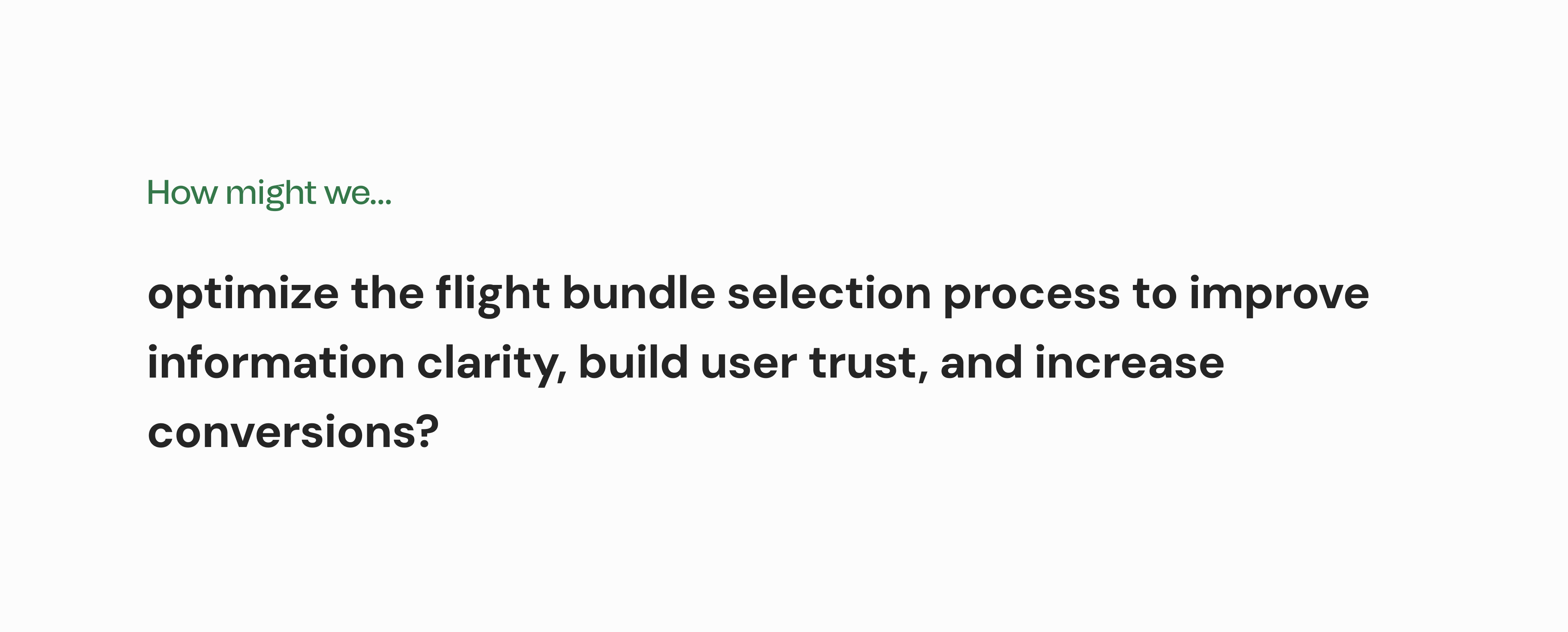
NARROWING SCOPE
The Design Opportunity
Insights from the online survey led me to the following guiding question:
ANALYZING THE EXISTING EXPERIENCE
Usability Studies
To analyze Flair's flight selection process more closely, I conducted 4 think-aloud usability studies to observe users’ impressions, expectations, and pain points with the existing process.
INSIGHT #1
Transparent pricing was a key factor in the booking experience of all participants.
INSIGHT #2
Participants wished it was easier to compare the available bundle options at a glance.
INSIGHT #3
Participants want to feel in control of the booking process and make informed decisions.
Taking a closer look...
Click each image to explore specific pain points and challenges observed by usability study participants.
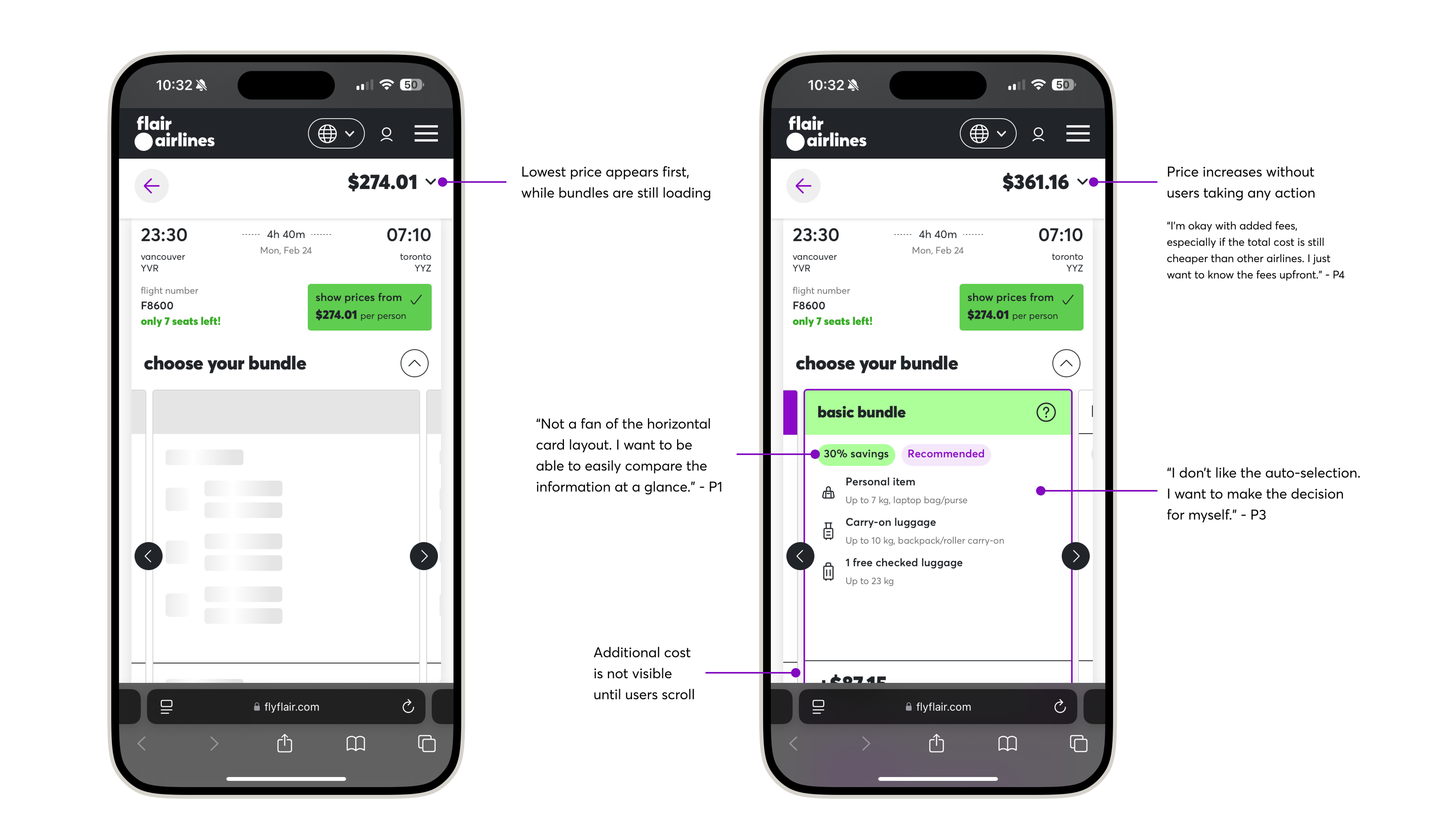
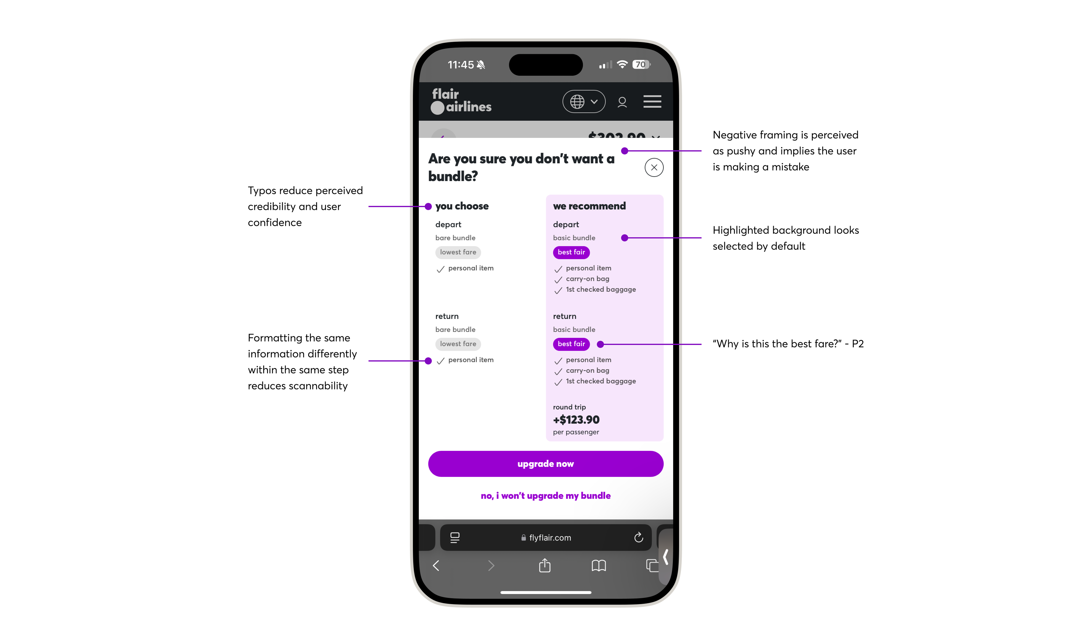
📌 Biggest Takeaway
The flight bundle selection was the first source of friction in the conversion funnel.
Clear pricing was essential to the booking experience for these users. Any lack of transparency or a mismatch between expectations and the actual price at this stage often led them to abandon the process and explore other airlines or third-party sites for better deals.
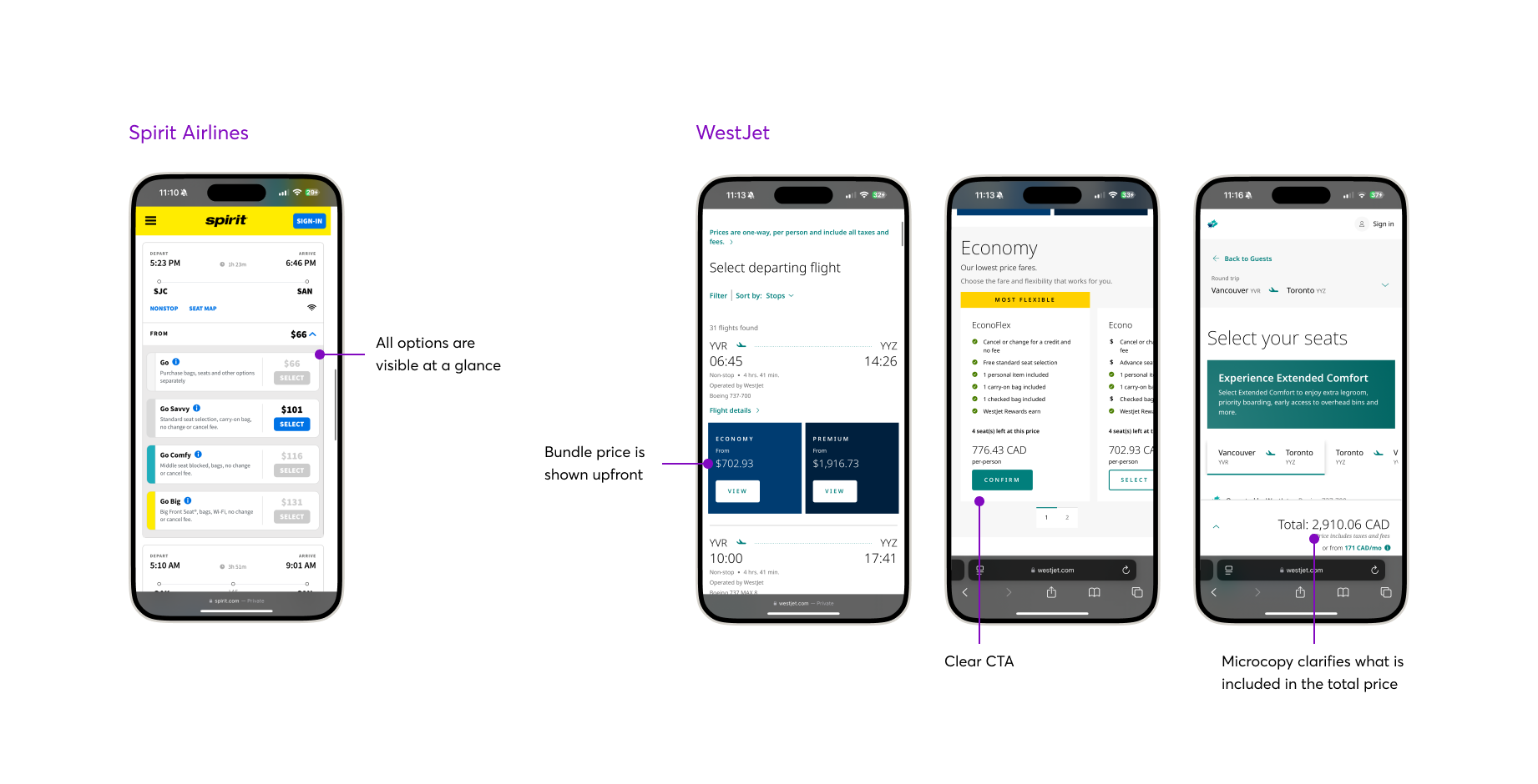
Competitive Analysis
To wrap up my research, I briefly reviewed competitor airline sites to identify common UX patterns and opportunities to improve the flight bundle selection experience.
FINAL SOLUTION
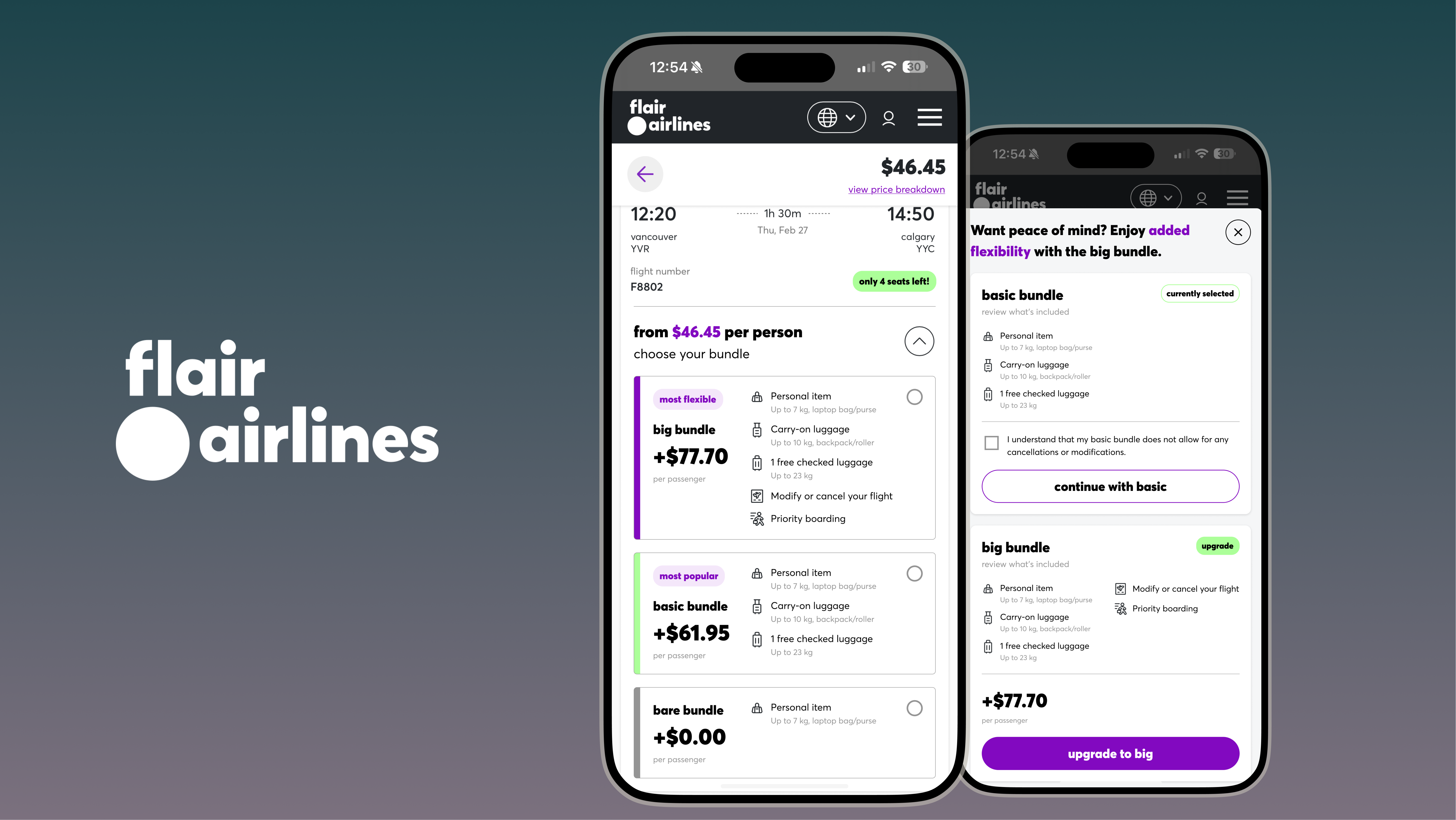
Redesigned Flight Bundle Selection
Based on all the data I collected, I crafted a simplified flight bundle flow to improve clarity, build trust, and drive conversions through intuitive design and transparent pricing.
KEY CHANGE #1
Improved bundle information clarity through a vertical layout
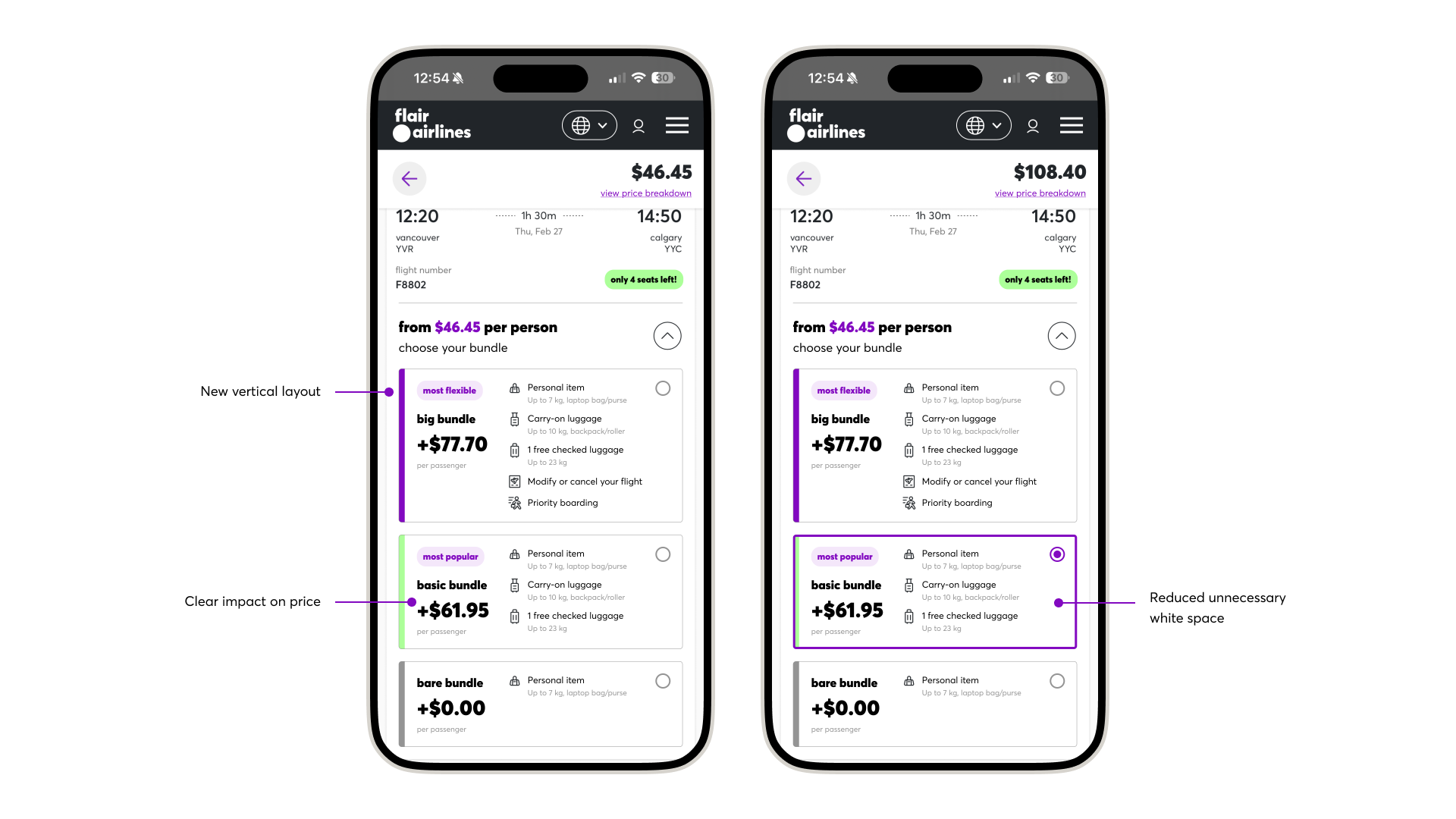
USER VALUE
Allows users to compare key information at a glance, without clicking or scrolling.
BUSINESS VALUE
Clear pricing upfront helps match user expectations more closely and reduces the likelihood of users dropping off early in the process.
KEY CHANGE #2
Enhanced pricing transparency through microcopy and interaction feedback
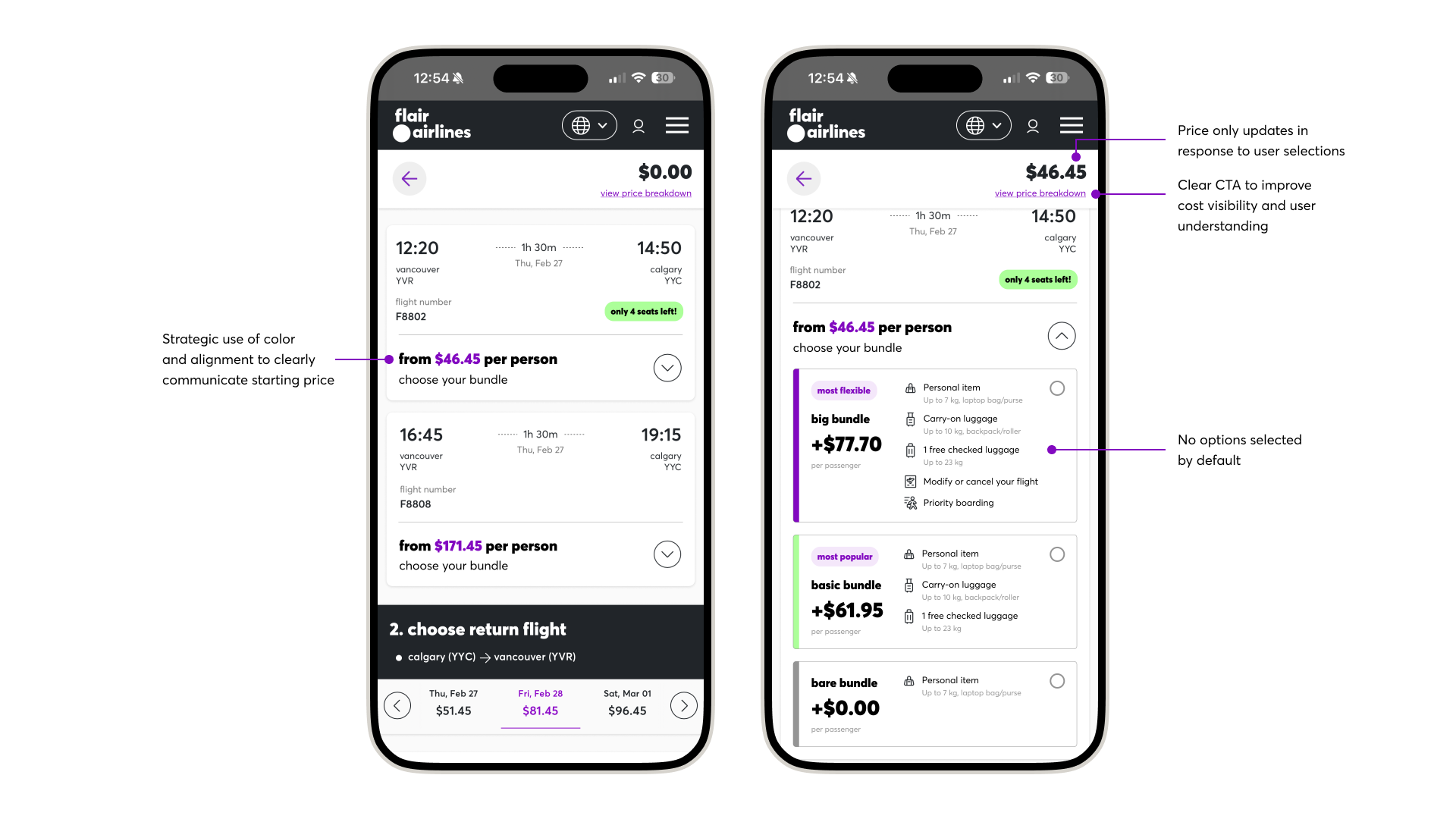
USER VALUE
Helps users understand the impact of selections more clearly, increasing confidence in the booking process.
BUSINESS VALUE
Many ultra low cost carriers have a negative reputation for hidden fees and dark UX patterns. Having a clear, upfront pricing model could make Flair stand out as a more customer-friendly airline, increasing overall trust in the brand.
KEY CHANGE #3
Refined copy and layout to communicate upsell value
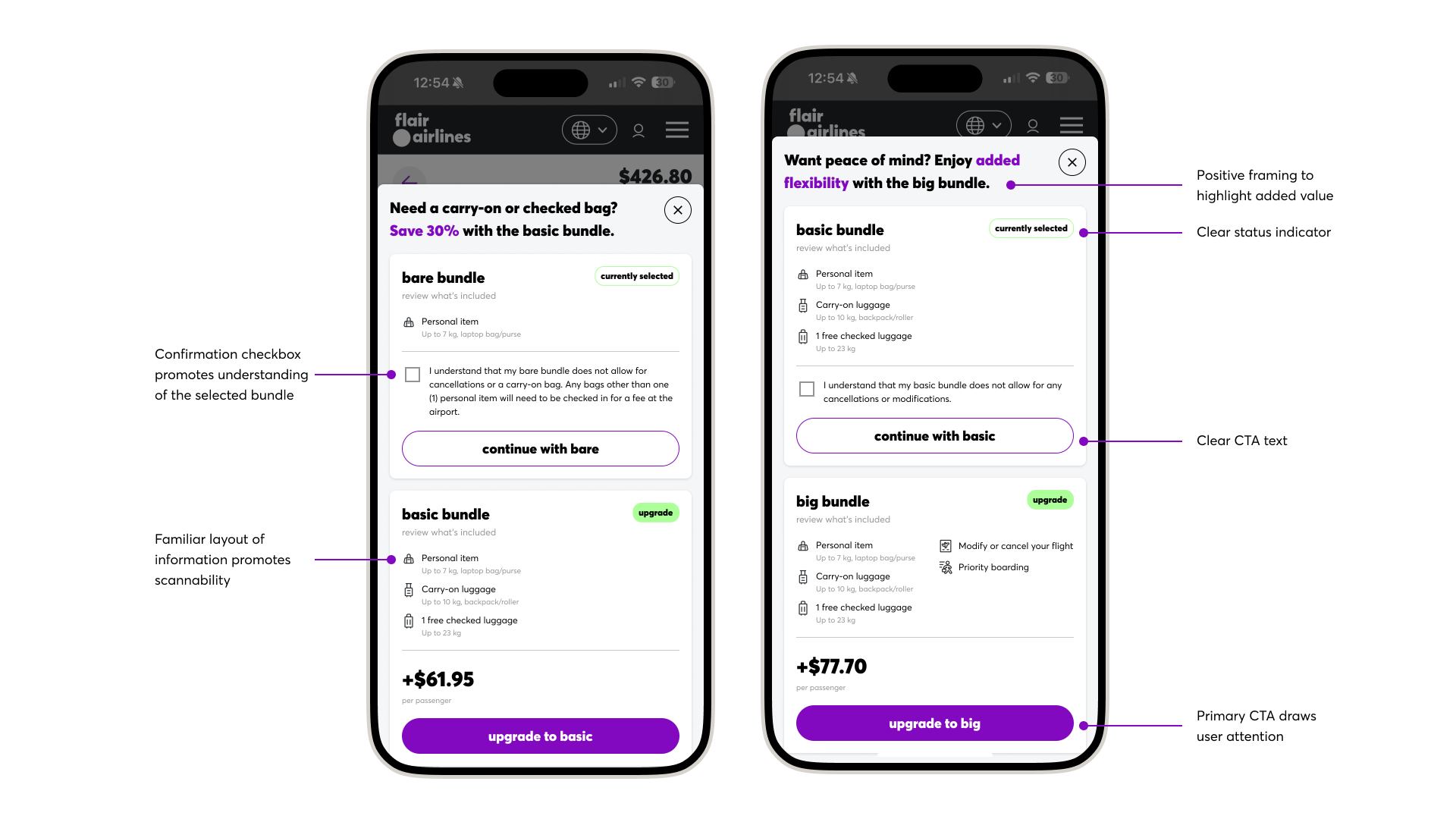
USER VALUE
Promotes clear understanding of the selected bundle and empowers users to make informed decisions through transparent options and positive framing.
BUSINESS VALUE
Improves clarity of airline policies, potentially reducing customer complaints over baggage allowance, and improves the upselling opportunity for ancillary sales.
FUTURE VALIDATION
A/B Testing Plan
As part of the design challenge, the final step involved creating an A/B testing plan for future validation of the design proposal. The test hypothesis, metrics, and implementation plan can be found in more detail below.
CONCLUSION
Final Takeaways
Designing for both users and business outcomes is a constant balancing act.
A highlight of this challenge was presenting my solution to the VP of Ancillary Revenue and Digital, where I defended my design decisions and tackled tough questions about balancing conversion goals with UX best practices.
Design is inherently subjective, and what’s best for the business doesn’t always align with what’s best for the user. Striking the right balance requires curiosity, an open mind, and a habit of asking “why” to deeply understand stakeholder goals and perspectives.
Looking ahead, I’ll be joining the Digital E-commerce team as a UX/UI Designer, where I’ll continue shaping digital experiences that make flying with Flair simpler, clearer, and more enjoyable.