Building design systems to enhance cross-product consistency and
scalability across SAP's analytics suite.
OVERVIEW
Timeline
August 2024 - April 2025
Team
4 UX Design Leads & 5 Developers
Toolkit
Figma, FigJam, HTML & CSS, Jira
Role
Designed 8 components and collaborated with 4 development teams on implementation, delivering
detailed specs, accessibility annotations, and implementation reviews.
Led internal communications to drive design system adoption, culminating in the official launch
of a Web UI Kit through an organization-wide presentation.
Impact
Within three weeks of launch, the DNA Web UI Kit saw rapid adoption – my Data Token component
alone was implemented over 1,000 times by designers across six teams – driving consistency
across multiple DNA product areas.
BACKGROUND
What is DNA Design?
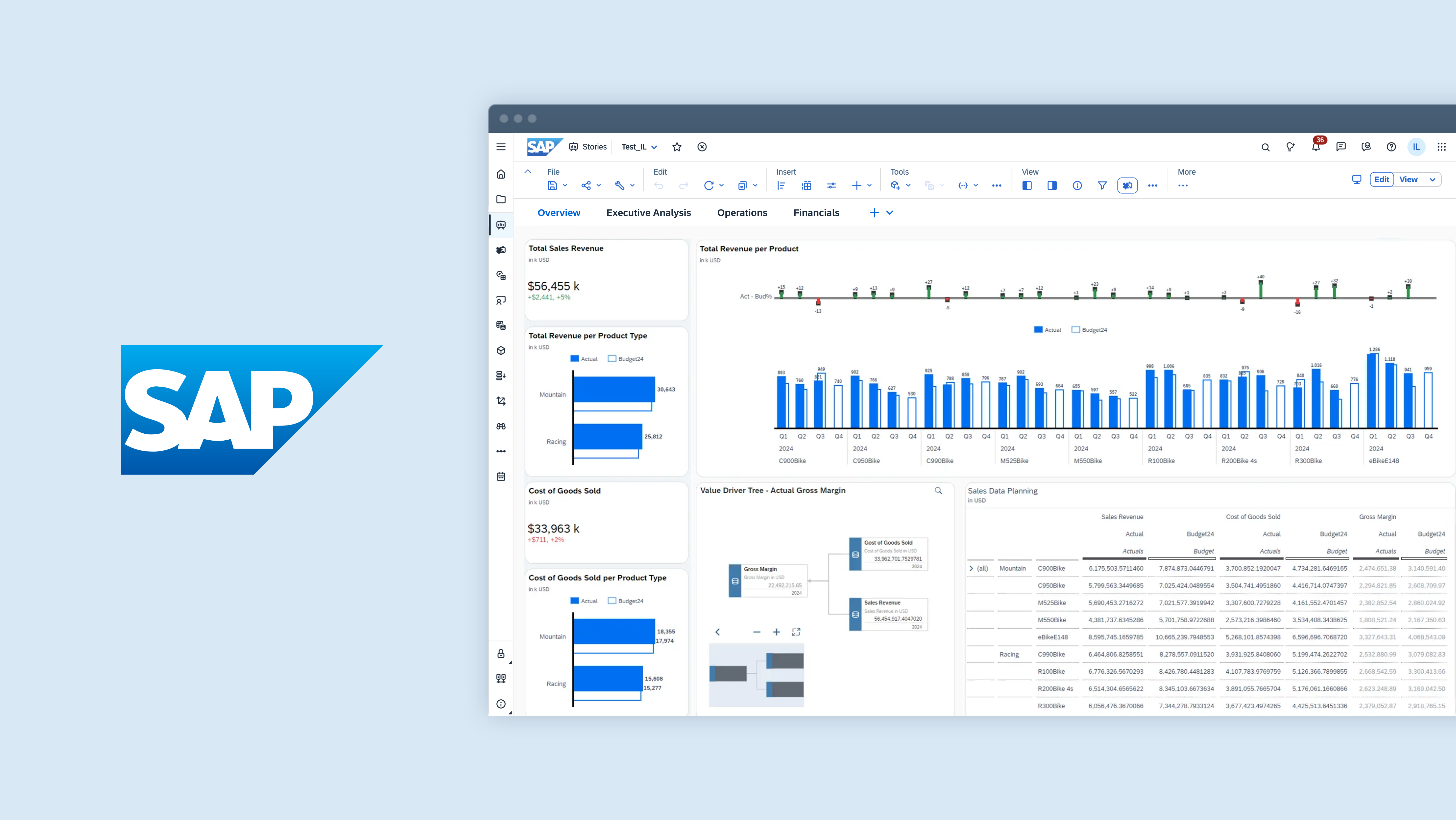
The Data and Analytics (DNA) Design team provides UX support for SAP
Analytics Cloud (SAC), SAP
Datasphere (DSP), and SAP Business Data
Cloud (BDC)
– SAP’s integrated suite of analytics products.
These products empower businesses to unify, visualize, and analyze their data at scale, enabling
smarter, real-time decision-making through business intelligence and augmented analytics.
As part of a multinational company, the DNA Design team spans 8 countries and includes over 165
designers, researchers, and technical writers.
INTRODUCTION
The Problem
We didn't have a centralized design library for DNA Design.
At the start of the project, our team lacked a centralized design library tailored to our products'
needs. While SAP provides a general SAP Web UI Kit, it serves all SAP products and doesn't fully
address the specific patterns, components, and requirements of the DNA product suite. As a result,
three key challenges emerged in our team's workflows:
CHALLENGE #1: INCREASED DESIGN EFFORT
Building custom components and patterns from scratch increases design time and
effort, reducing efficiency in our workflows.
CHALLENGE #2: INCONSISTENT IMPLEMENTATION
When different designers create their own version of the same components, UI
inconsistencies can quickly emerge across DNA products.
CHALLENGE #3: POOR SCALABILITY & MAINTENANCE
Adapting designs for new features and products becomes inefficient, making it
harder to ensure long-term consistency and streamline updates across teams.
The Solution
Introducing... the DNA Web UI Kit!
The DNA Web UI Kit builds on the existing SAP design system to centralize custom components,
patterns, page layouts, and guidelines across our analytics products.
Key features include: usage guidelines for designers, common usage examples,
visual specifications for developers, and accessibility annotations.
×
MY PROCESS
Step 1: Stakeholder Alignment
Gathering component requirements from designers across our product
suite.
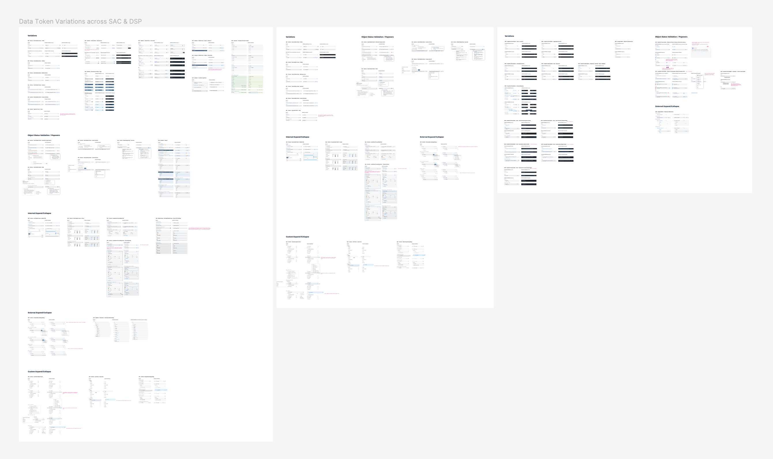
When building components for cross-product use, the first and most
significant step was consolidating existing use cases across all DNA products. This involved close
collaboration with designers from various product areas – sometimes up to 10 contributors for a
single component, like the Data Token – before aligning on a unified design proposal.
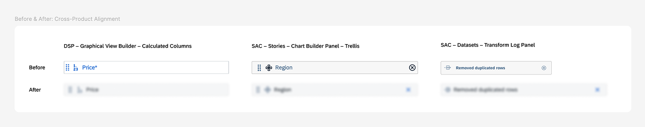
Before: How can a data token have so many variations?
×
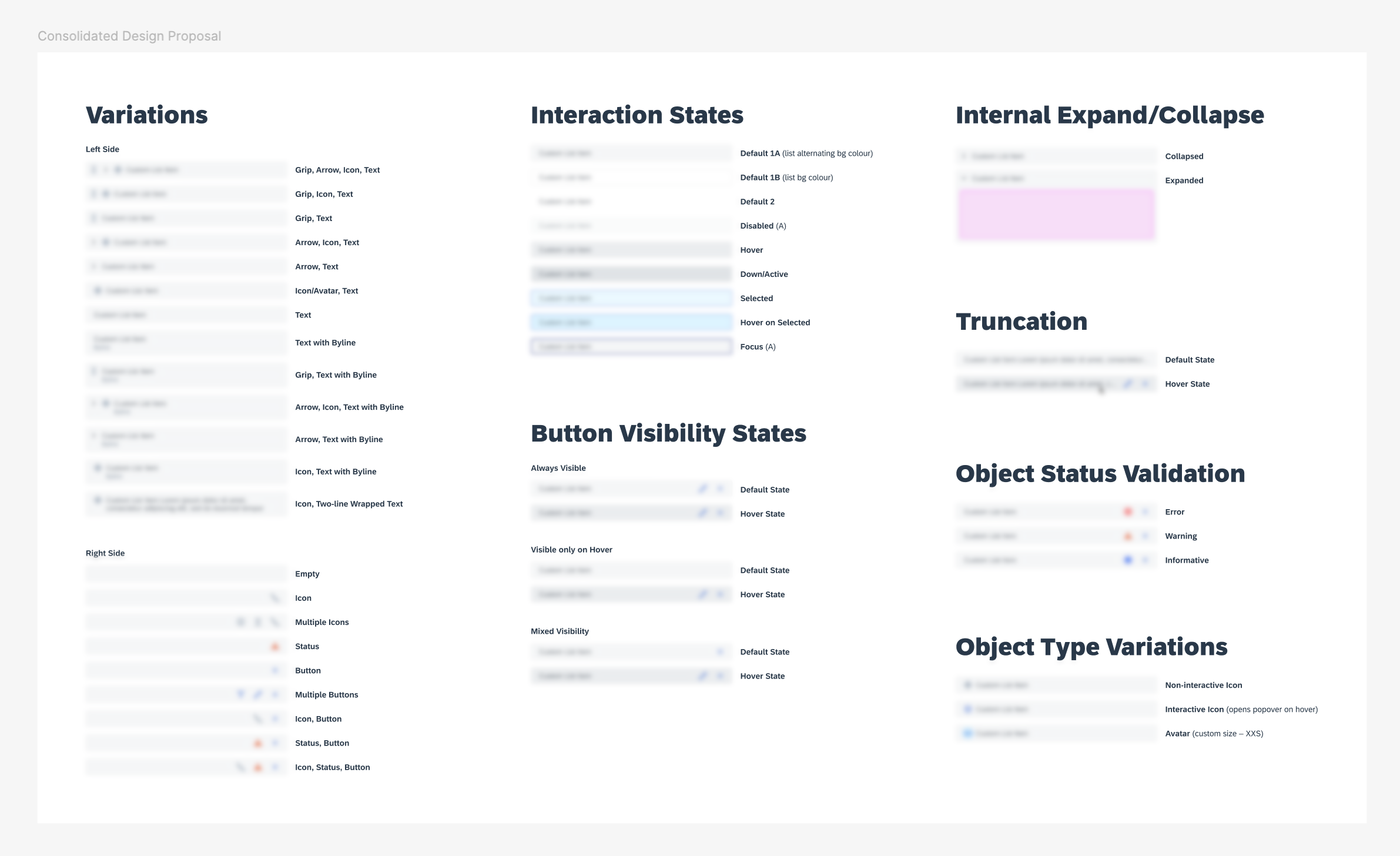
After: A consolidated data token design proposal for SAC and DSP
×
Certain elements are hidden due to NDA restrictions. For more details, feel free to
reach out to me on LinkedIn!
Quick comparison: Before vs after cross-product alignment
×
Certain elements are hidden due to NDA restrictions. For more details, feel free to
reach out to me on LinkedIn!
Step 2: Building Components
Creating intuitive, customizable, scalable, and accessible components
for
designers.
After the unified design was approved by the design leads from relevant product areas, I
built the components in Figma with a focus on ease of use, customizability, and scalability.
Accessibility considerations, such as minimum target sizes and keyboard navigation support, were
also prioritized throughout the process.
At this stage, I also documented usage guidelines for designers and curated common usage examples to
showcase how the component could be applied in practice.
Certain elements are hidden due to NDA restrictions. For more details, feel free to
reach out to me on LinkedIn!
Step 3: Collaborating with Development
Delivering detailed visual specifications and implementation testing.
To ensure a smooth implementation process, I collaborated with the development team early
on to identify the key visual specifications needed for handoff. This allowed me to format
annotations in a way that was clear and developer-friendly – providing the right level of detail
without overwhelming documentation.
Once development completed their implementation, I conducted a detailed review of the
test server using browser inspection tools to ensure pixel-perfect alignment with the design specs.
Any inconsistencies were documented and sent back to development for refinement before I
provided final UX sign-off.
Step 4: Leading Internal Communications
Driving adoption through a global launch and ongoing engagement.
Over the course of nine months, 17 core component and pattern pages were completed by
various members of the design systems team — including 8 that I designed and documented
myself.
While the full DNA Web UI Kit is expected to include around 80 assets, these core
components were ready for use and served as the catalyst for the official launch.
To support adoption, I led the internal communications strategy for the Web UI Kit rollout. A key
milestone was presenting the kit at our global Q2 DNA Design meeting, bringing together teams across
time zones and product areas.
Beyond showcasing new components, the goal was to increase visibility into
available features, align on shared processes, and establish a feedback loop for continuous
improvement. This alignment helped streamline collaboration, reduce redundancy, and strengthen the
foundation for scalable, system-driven design.
×
Step 5: What's Next?
Establishing communication channels and feedback loops.
To maintain momentum post-launch, the team plans to introduce a recurring design systems
newsletter to share learning resources and Web UI Kit updates. We also established a
comment-based feedback loop to gather usage questions and requests for new components
directly from designers.
Looking ahead, the DNA Web UI Kit is an ongoing project and more
components are expected to be added in subsequent library updates.
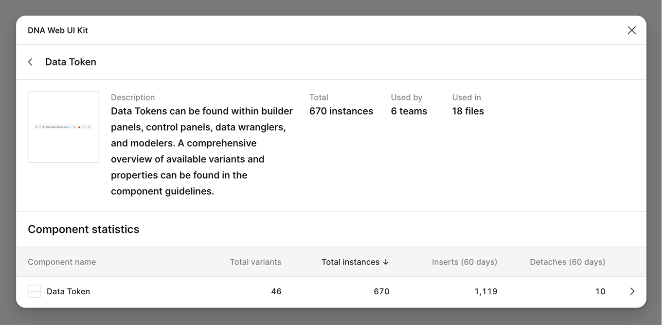
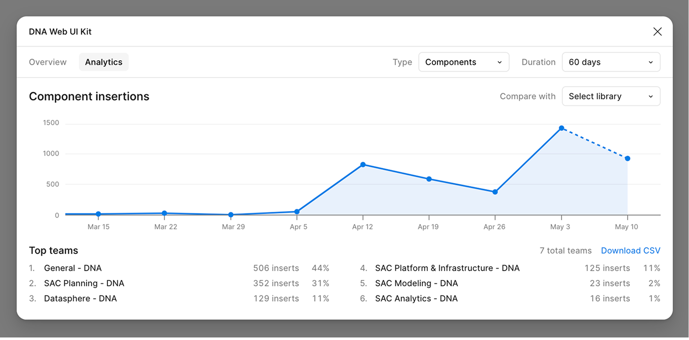
Impact
Creating a single source of truth to help designers work faster.
Since launching the DNA Web UI Kit, adoption of our core components has grown rapidly across
multiple DNA product areas. As of May 1 – just three weeks post-launch – the Data Token component
alone
had been used over 1,000 times by designers from six different teams.
×
×
Reducing UX debt and future-proofing our designs for scale.
The DNA Web UI Kit marks a major step forward in streamlining and unifying our design
and development workflows. Bringing this kit to life required close coordination with global
design teams and thoughtful consideration of technical constraints across development
frameworks. In doing so, we’ve laid a strong foundation for minimizing UX debt and supporting
scalable, consistent design practices moving forward.
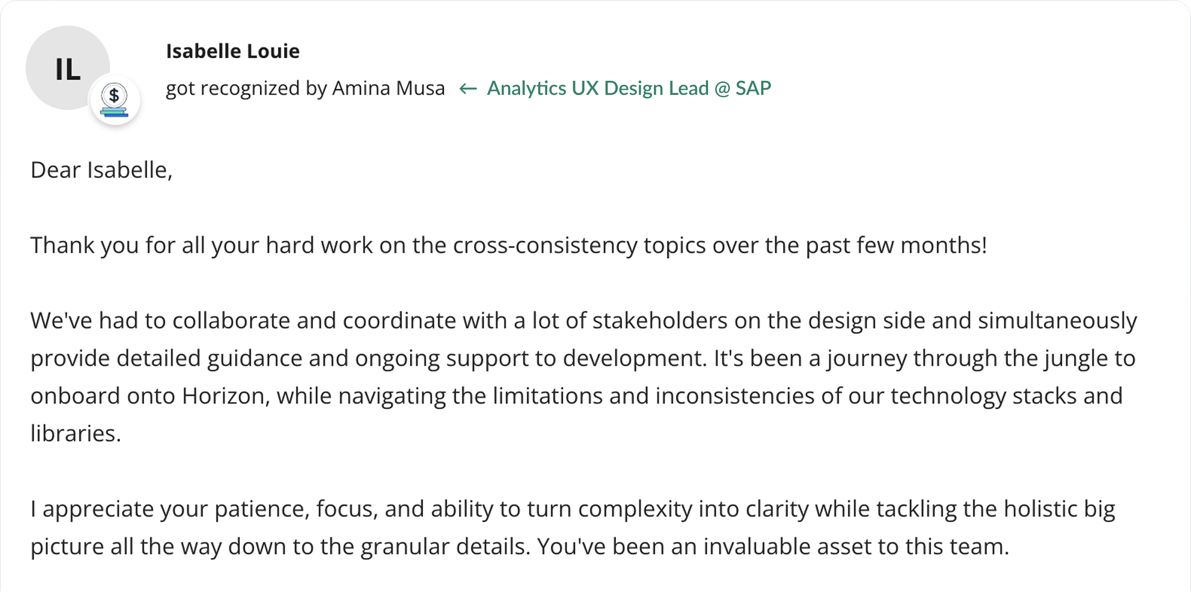
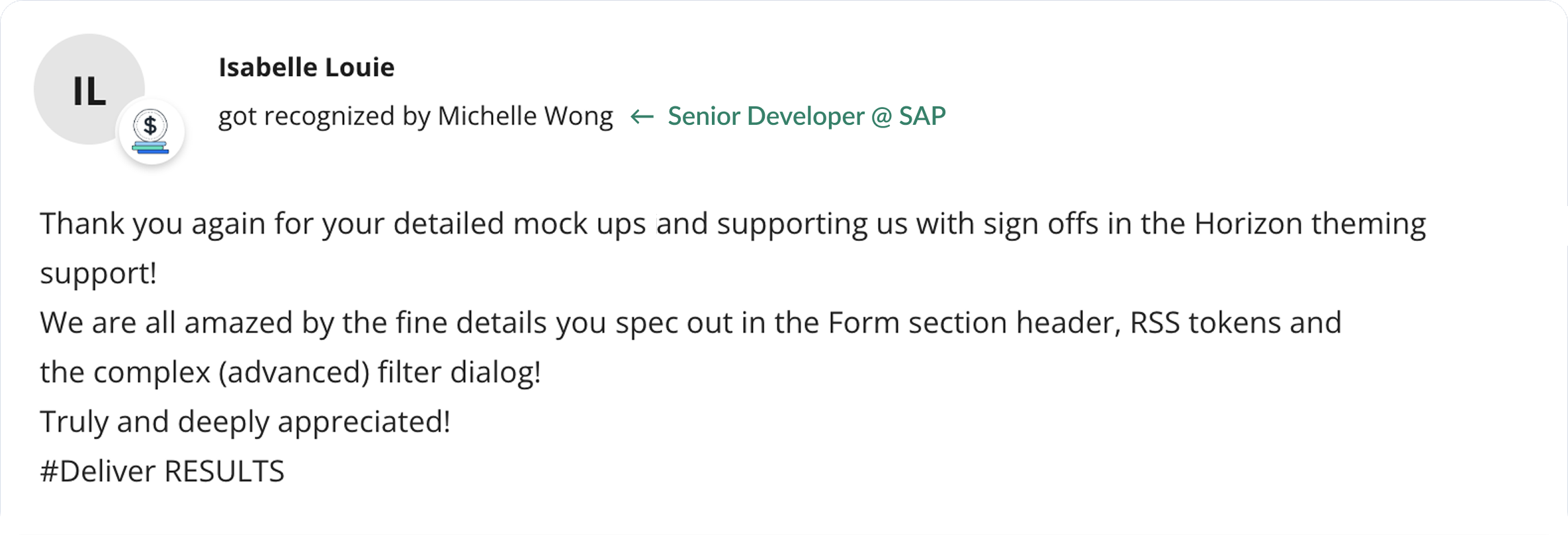
AWARDS & RECOGNITIONS
Feedback from Collaborators
Here are a few thoughtful messages from the designers and developers I had the
pleasure of collaborating with throughout this project!
×
×
CONCLUSION
Final Takeaways
Learning to scale design through systems thinking and
cross-functional partnership.
This project was a major learning experience that deepened both my understanding of
design systems and my appreciation for cross-functional collaboration.
Working closely with multiple development teams exposed me to the realities of legacy technical
constraints and the variety of development libraries in use across products. I quickly
learned the importance of building strong, open relationships with developers – fostering a shared
language and mutual understanding to bridge design and implementation. As designers, we often play
the role of translators, aligning stakeholders from design, development, and product toward a common
goal.
This experience also solidified my interest in design systems as an area of long-term
growth. I’m excited to continue exploring how systems thinking can improve scalability, consistency,
and collaboration across teams.
Throughout this process, one of the guiding principles I kept returning to was:
“strong opinions, held loosely.” I've learned to advocate for my ideas with clear
rationale and research, while remaining open to feedback and willing to evolve solutions through
conversation and collaboration.
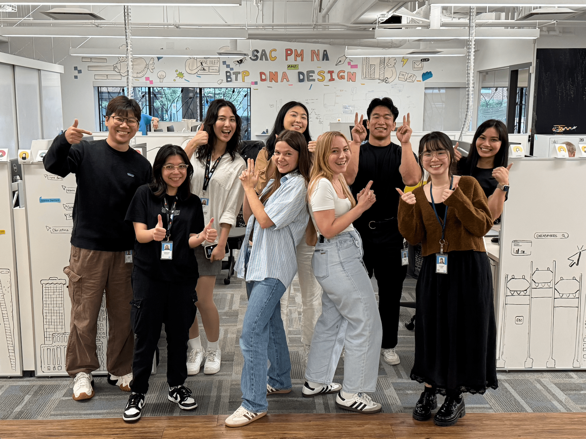
Thank you to my wonderful team 💙
×
EXTRACURRICULAR INVOVEMENT
Getting Involved + Other Fun Opportunities
As someone who is deeply passionate about building inclusive and engaging
communities, I thrive on creating opportunities for people to connect and
collaborate.
Luckily, SAP feels the same way! During my internship, I've had the opportunity to get
involved
in various Employee Network Groups (ENGs) and participate in many community initiatives.
As the Operations Lead / Coordinator for the Canada-Wide Intern Committee, I
facilitated weekly
meetings, ensured Event Managers receive adequate support and budget, and maintained
close
coordination with our sponsors and advisors.
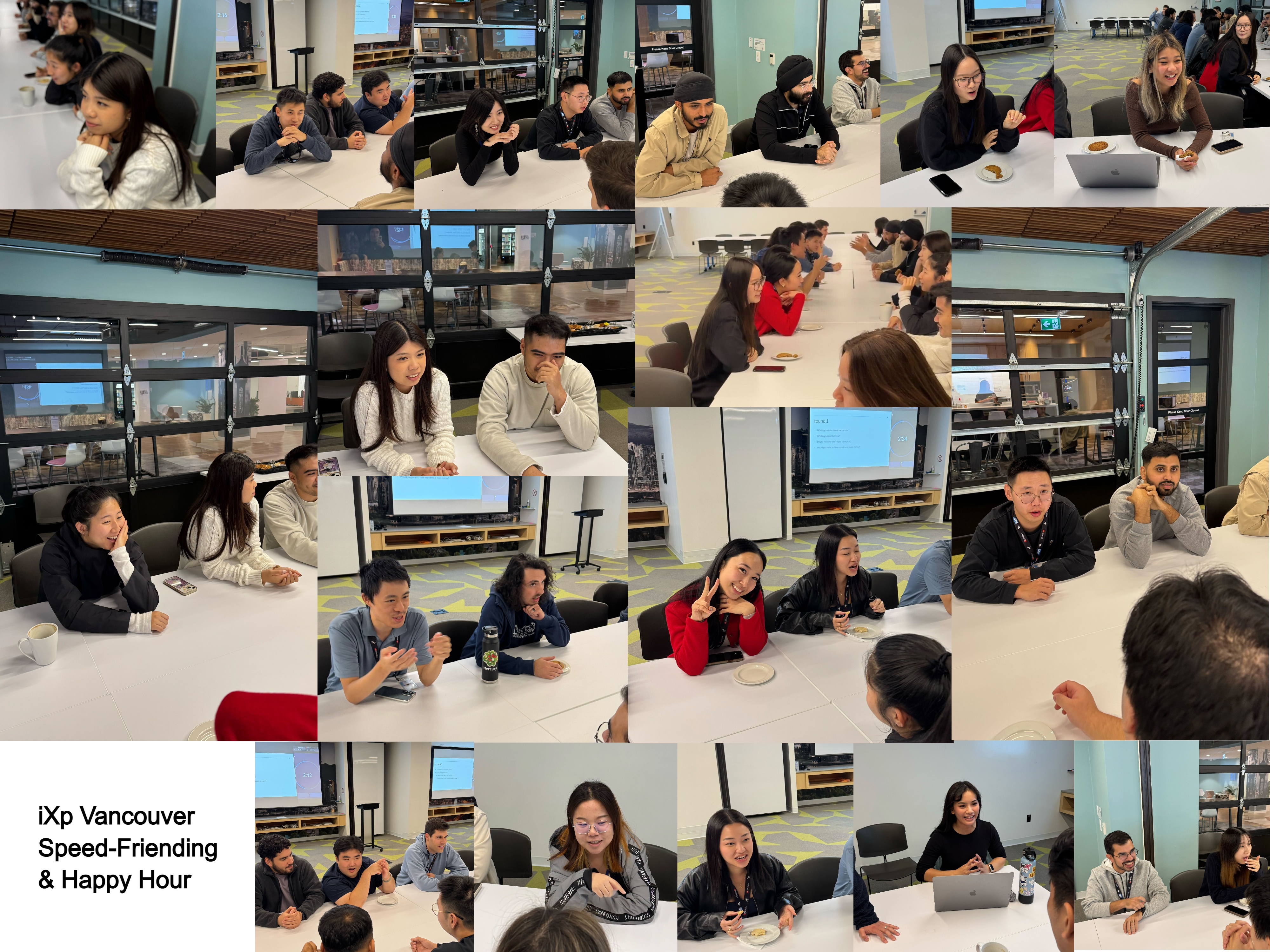
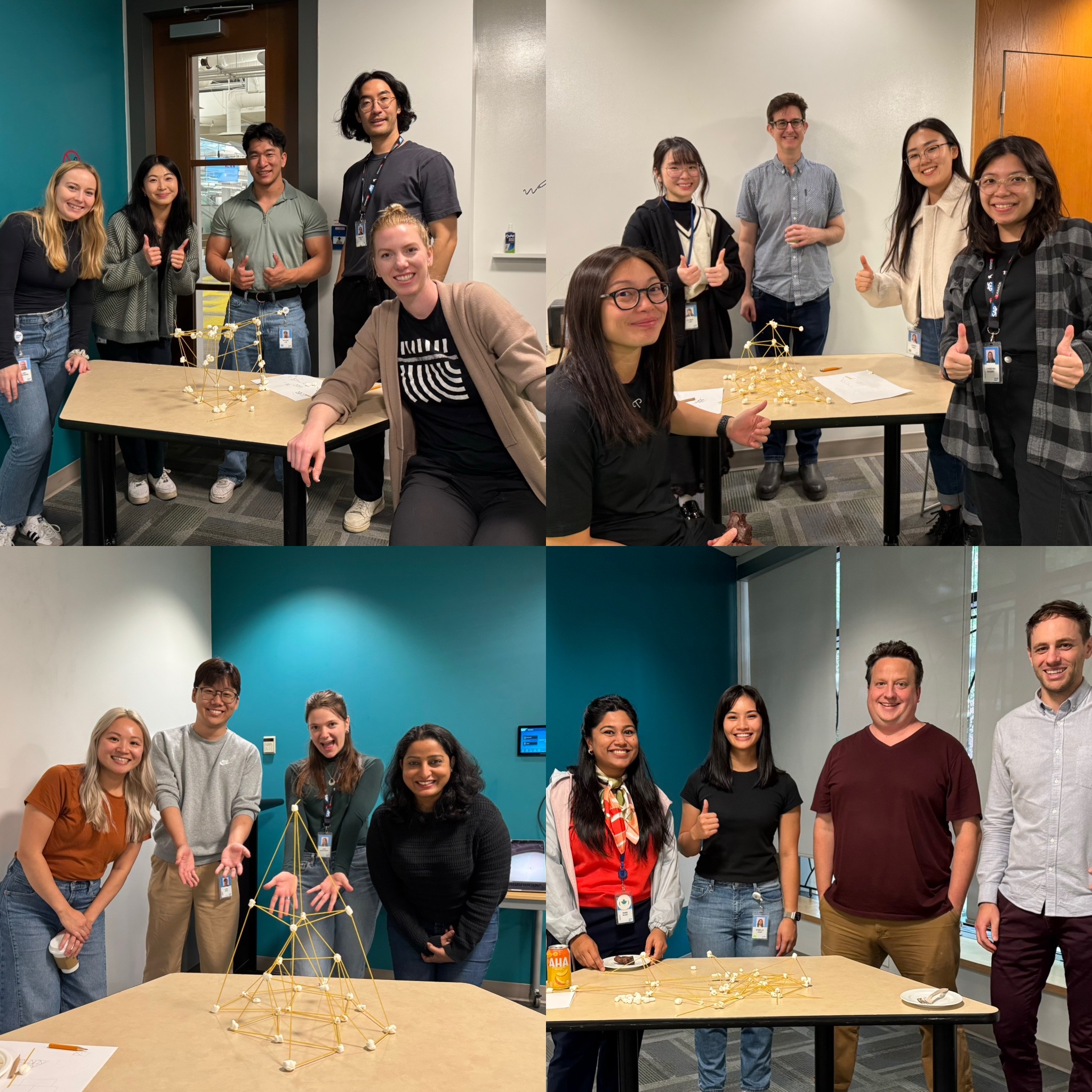
In addition to these responsibilities, I organized four networking and social events
for
the Vancouver intern community!
×
×
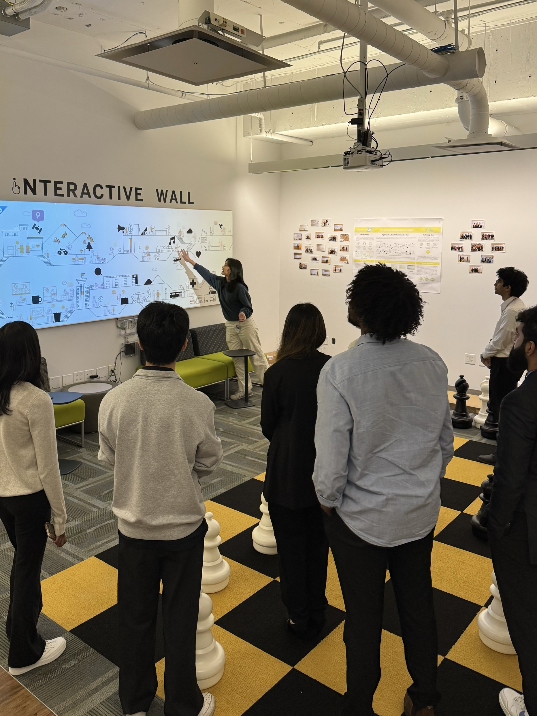
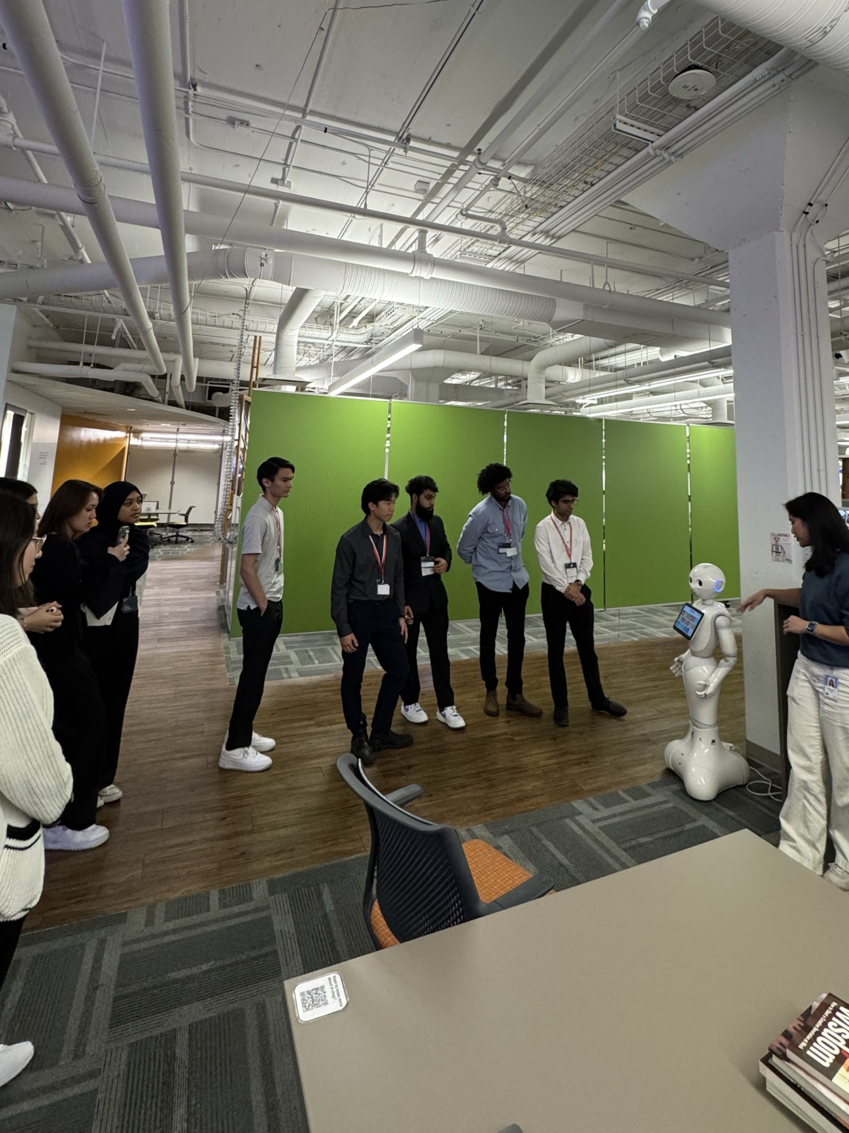
Originally known as the 'Developer's Workshop', d-shop is SAP's very own maker
space. As a tour guide, I showcase our innovative projects and initiatives to
external
visitors,
such as international consular staff, university groups, and community
organizations.
I also help promote internal workshops, events, and ongoing projects,
fostering
a culture of creativity and hands-on learning within the organization.
×
×
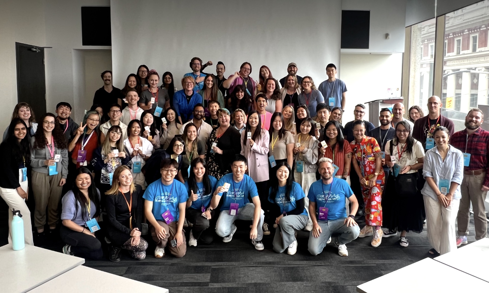
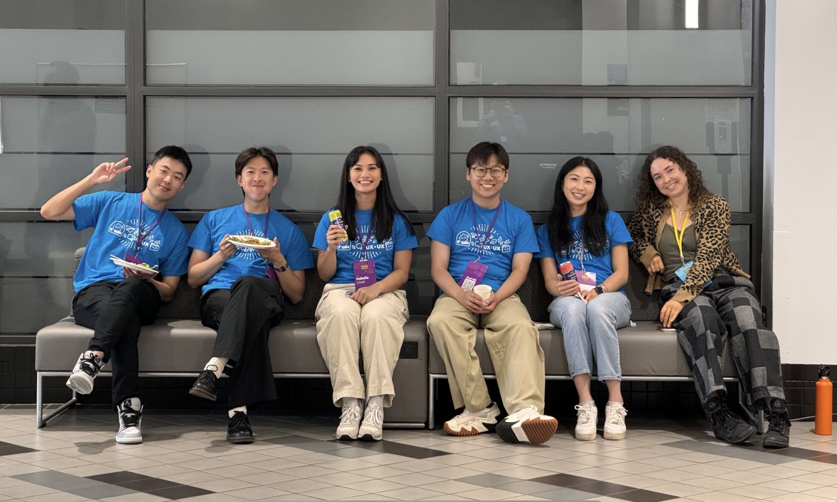
As a volunteer at this year's 3-day UX conference, I helped welcome over 200
attendees, including designers, engineers, product owners, program managers,
students, and
more.
I also supported our 16 speakers by facilitating Q&A sessions and ensuring workshop
materials were prepared and available.