SAP
Building the Data & Analytics Web UI Kit
Designing a shared component library and rollout strategy for 165+ designers across SAP’s analytics products.
OVERVIEW
Timeline
August 2024 – April 2025 (Build & Launch)
July 2025 – Present (Strategy & Growth)
Team
4 UX Design Leads & 5 Frontend Developers
Role
Designed 11 components and collaborated with 4 development teams on implementation.
Led communications to drive adoption across our organization of 165+ designers.
Shaped the post-launch strategy for the kit, including release cadences, a contribution framework, and a design system resources portal.
Impact
Since launch, the DNA Web UI Kit has been used across 150+ design projects. My Data Token component alone grew to 115,000+ inserts, becoming the most widely used DNA component across the organization.
Within months, 100+ designers had also onboarded to the design system portal to access release notes and learning resources.
BACKGROUND
What is DNA Design?
The Data & Analytics (DNA) Design team supports SAP Analytics Cloud, SAP Datasphere, and SAP Business Data Cloud. Together, these products help businesses unify, visualize, and analyze data at scale.
The team spans 8 countries with 165+ designers, researchers, and technical writers.
A closer look at SAP Analytics Cloud, one of three products supported by the DNA Design team
THE PROBLEM
165+ analytics designers with no shared design library
SAP’s Web UI Kit provides foundational tokens and atoms, but not the DNA-specific patterns our analytics products rely on. This created three key challenges:
CHALLENGE #1: INCREASED DESIGN EFFORT
Building custom components from scratch increases design time and reduces efficiency.
CHALLENGE #2: INCONSISTENT IMPLEMENTATION
When designers create their own versions of the same components, UI inconsistencies emerge across DNA products.
CHALLENGE #3: POOR SCALABILITY & MAINTENANCE
Adapting designs for new features becomes inefficient without a shared, maintainable foundation.
THE SOLUTION
Introducing the DNA Web UI Kit
The DNA Web UI Kit extends from SAP's design system to centralize DNA-specific components, patterns, and layouts. Each page includes usage guidelines, implementation examples, visual specs for developers, and accessibility annotations.
MY CONTRIBUTIONS
I designed 11 components and patterns for the DNA Web UI Kit
Each involved alignment with product design and development stakeholders, building the component and writing documentation, and completing a final quality sign-off with the UI Kit Owner.
Certain elements have been hidden or recreated due to NDA restrictions.
Avatar
DNA-specific avatar with variants for our 10 personas.
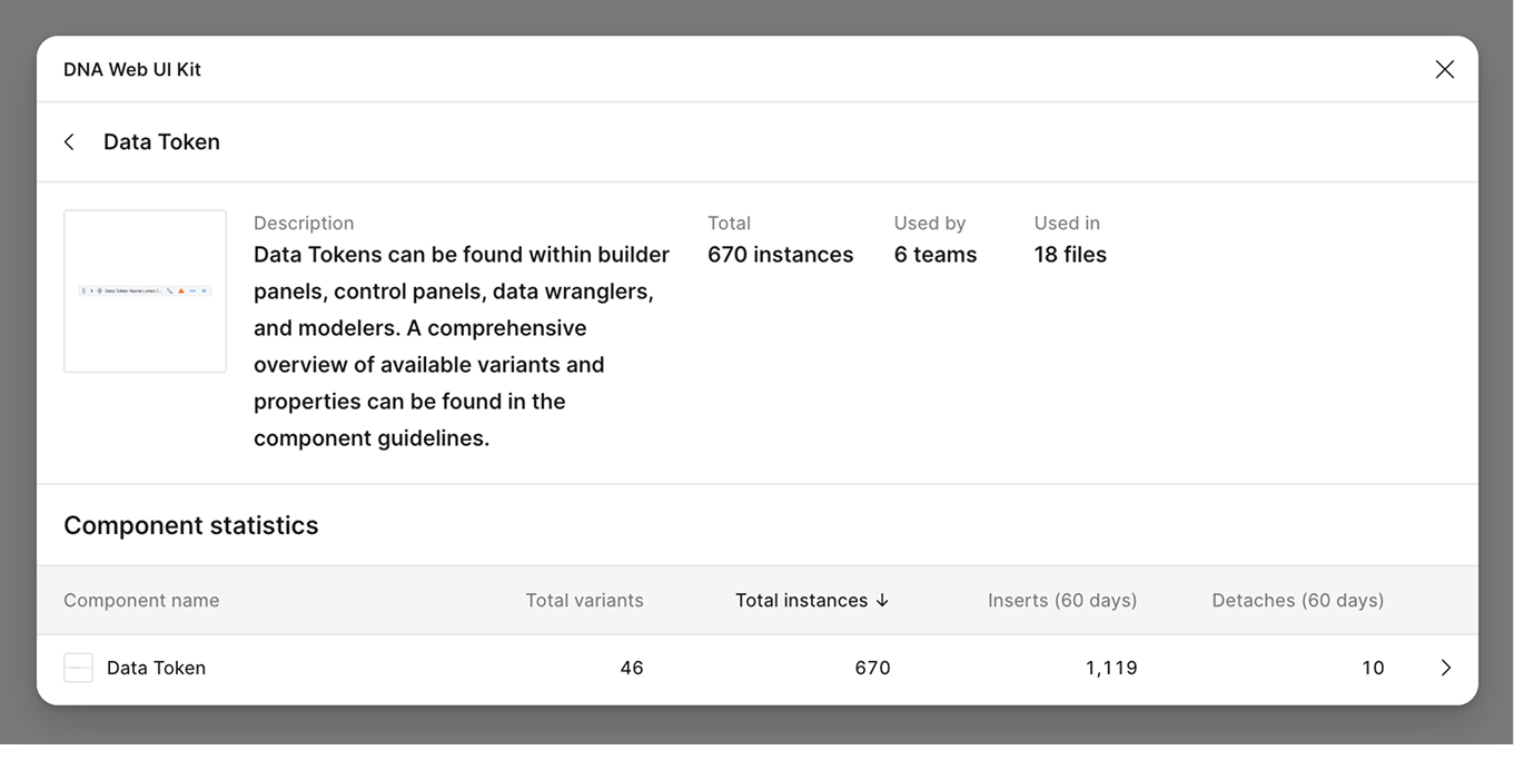
Data Token
Interactive tokens for configuring data visualizations.
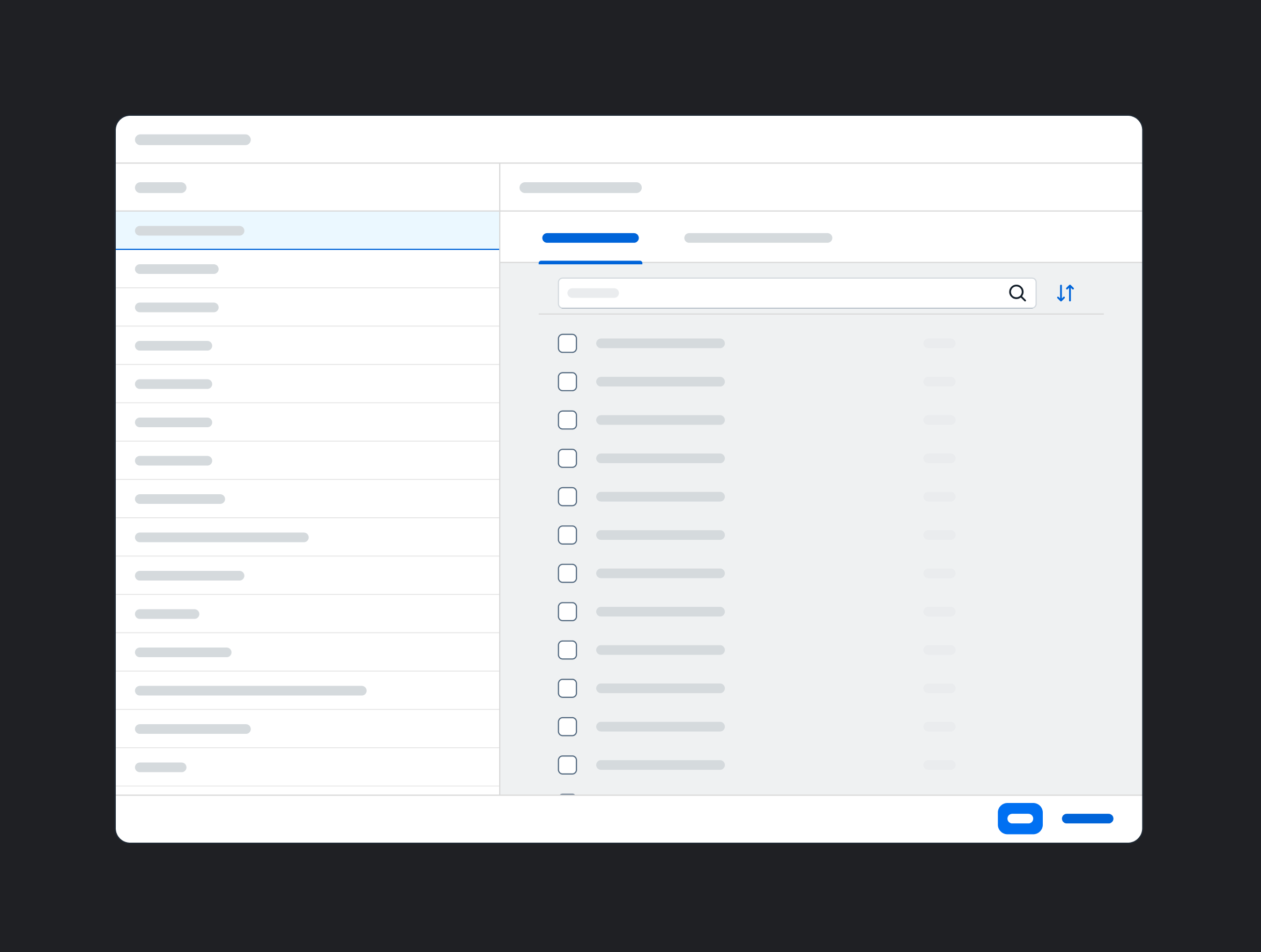
Filter Settings Dialog
Dialog for managing filter configurations.
FPA Icon Guidelines
Documented usage guidelines for the FPA icon font.
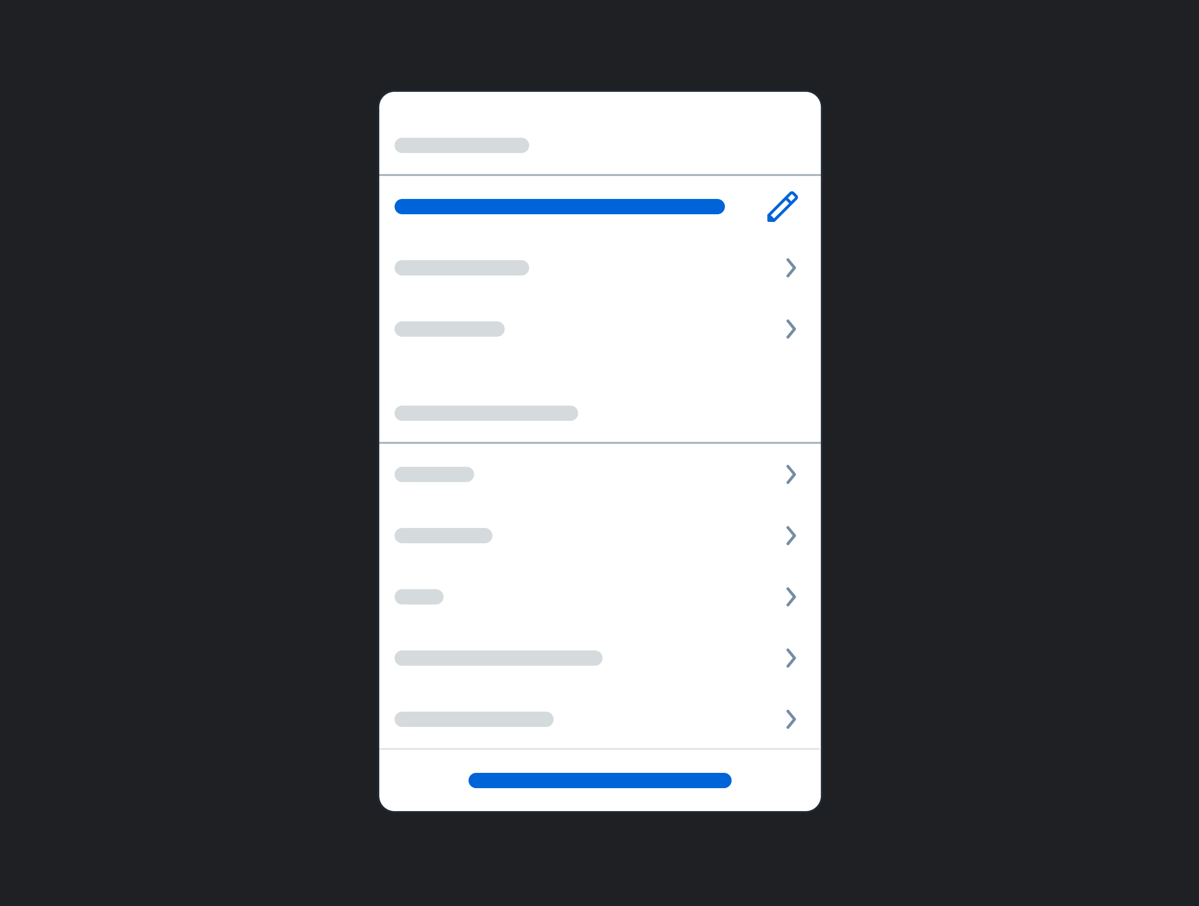
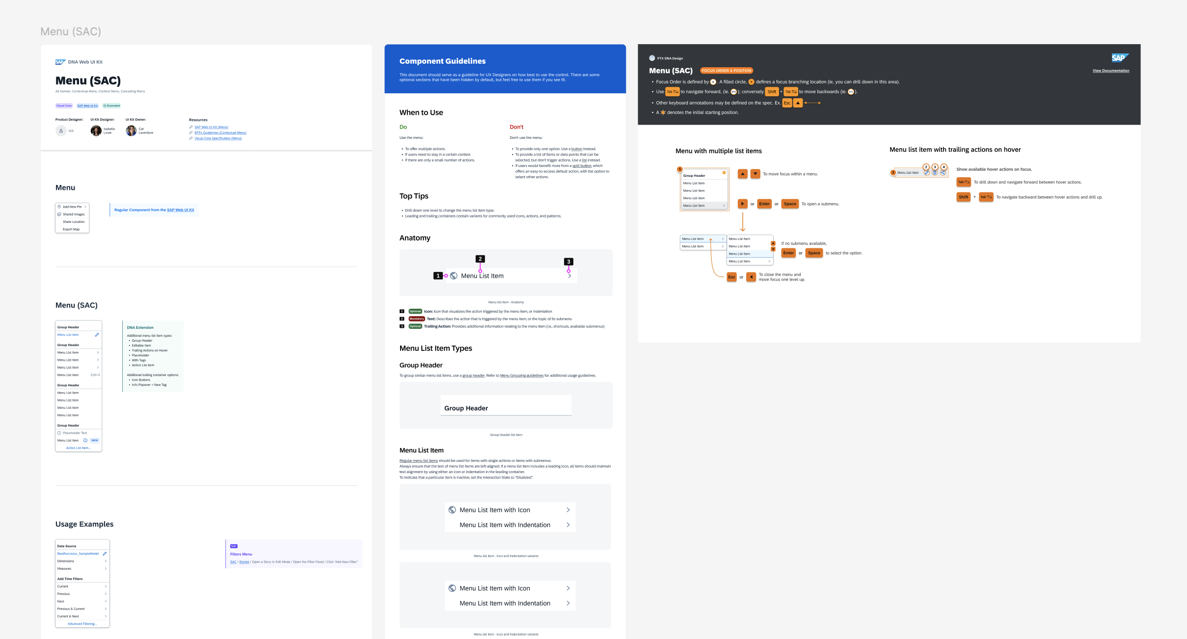
Menu
Common contextual menu patterns for DNA products.
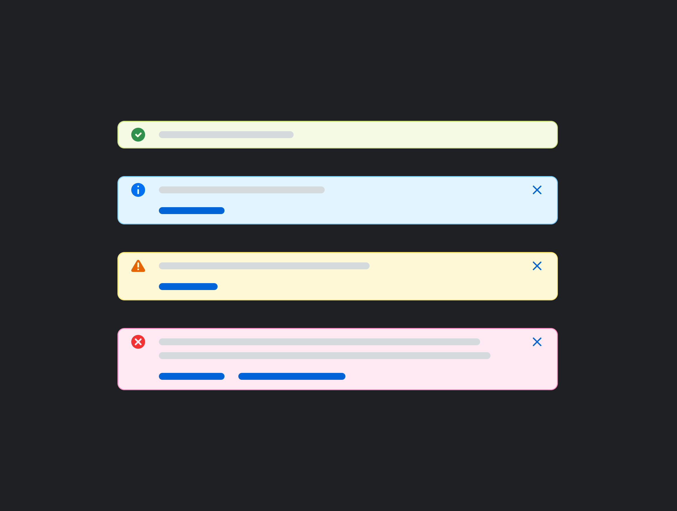
Message Strip / Toast
Message strip notification patterns for DNA products.
Semantic Icons
Guidelines and standards for semantic icon usage.
Settings
Settings dialog with variants for product-specific pages.
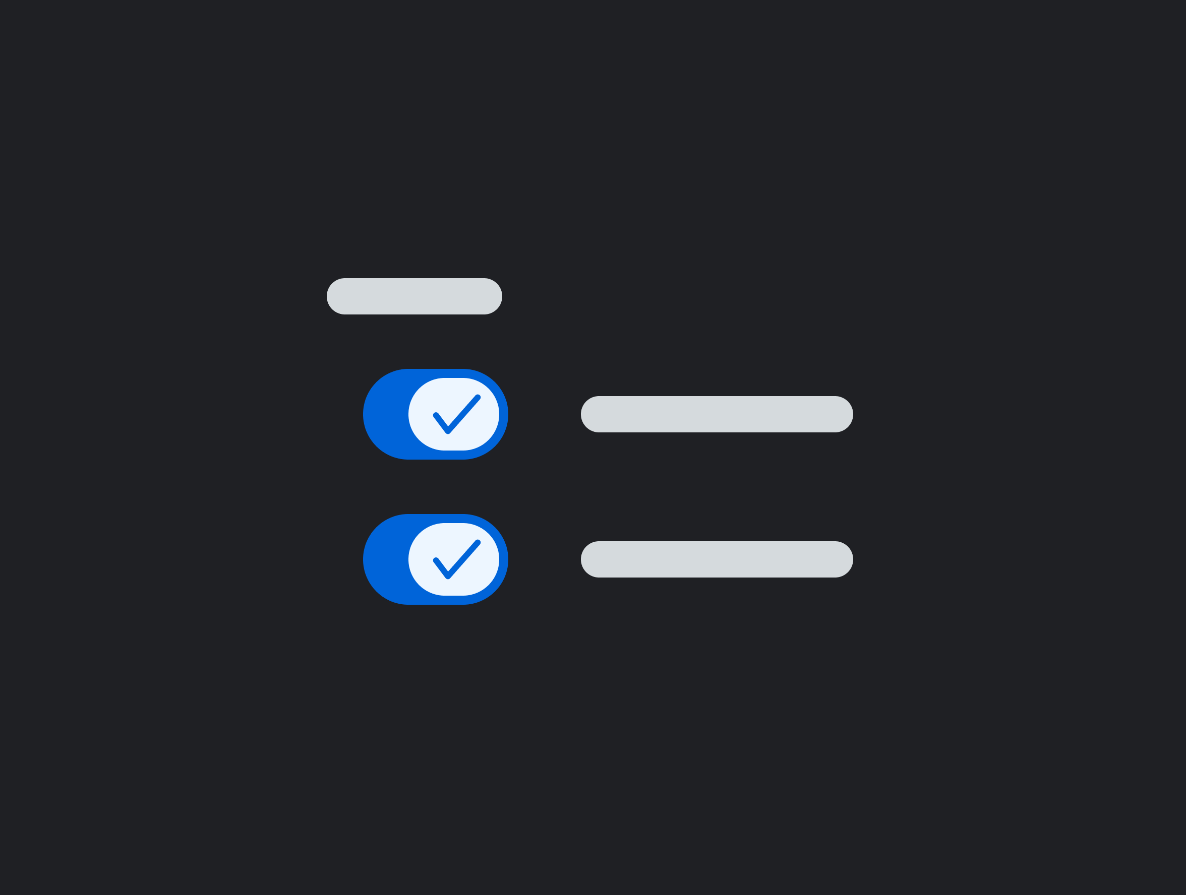
Switch
Guidelines for switch alignment and grouping patterns.
Upload File Dialog
Dialogs for file upload interactions.
User Menu
User account and profile menu.
COMPONENT SPOTLIGHT
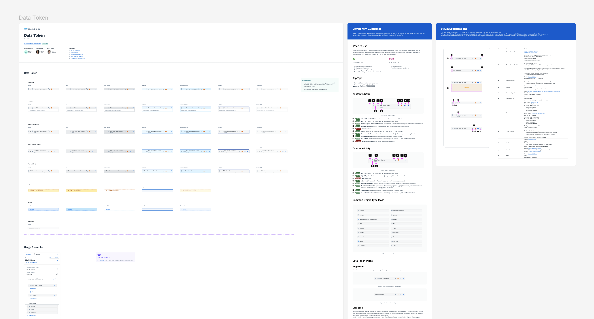
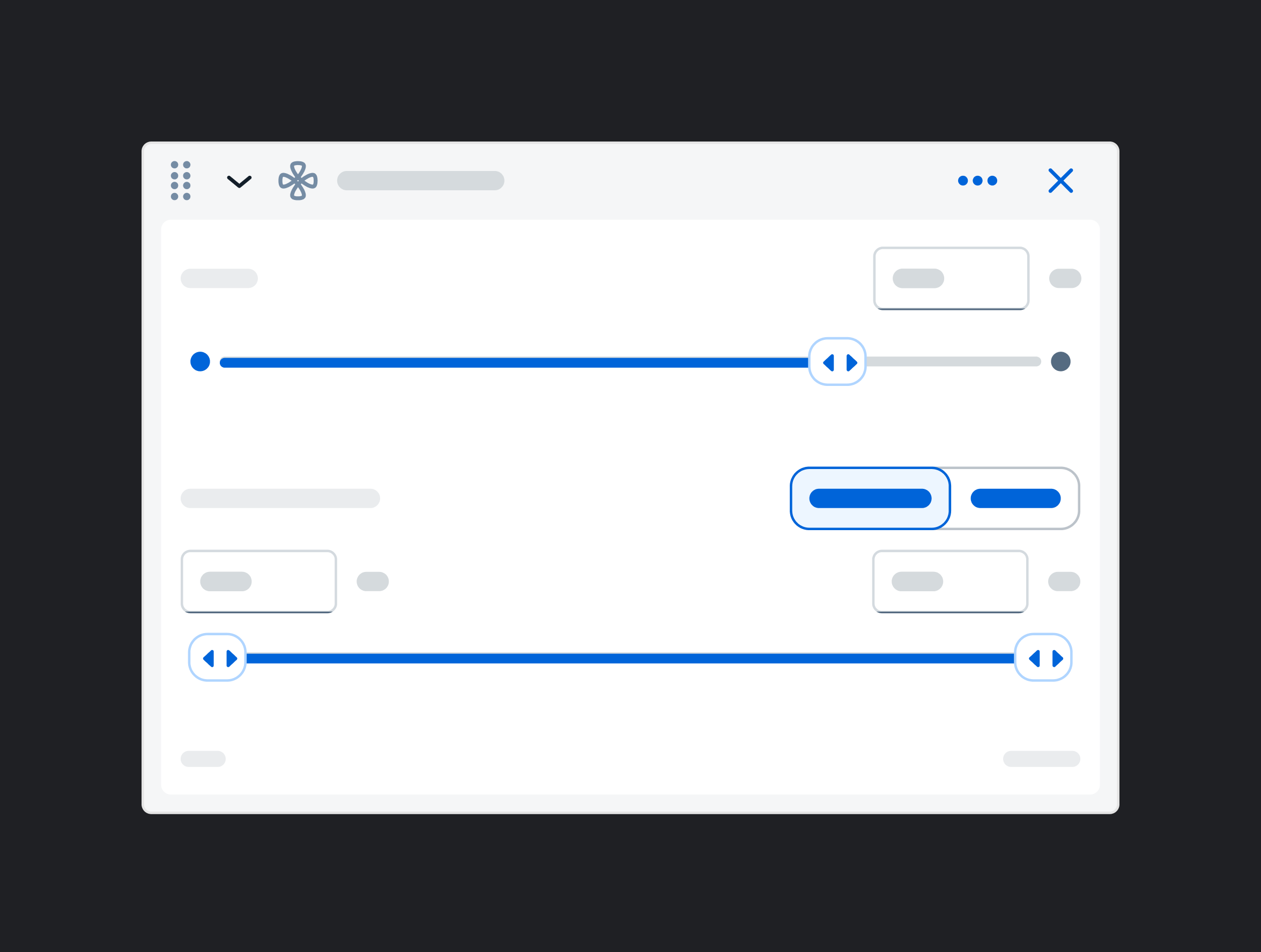
A deep dive into the Data Token, one of the kit's most complex components
The Data Token is one of the most frequently used elements in SAP Analytics Cloud (SAC) and Datasphere (DSP).
For customers, it’s the main interaction point for building and configuring data visualizations. For designers, it appears in nearly every analytics workflow, making it one of the first components they reach for.
It was also one of the most complex components I worked on, requiring alignment across 10 design stakeholders.
Step 1: Stakeholder Alignment
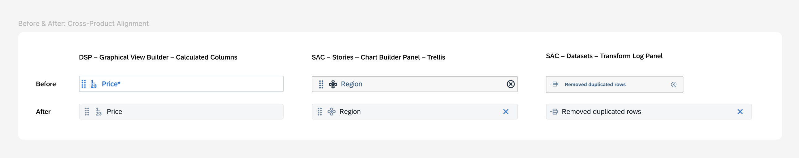
The Data Token existed in fragmented forms across SAC and DSP – each product had developed its own variations independently, with no shared foundation.
Before building the component, I needed to align the foundational pattern across both products, including spacing, size, color, text styles, and internal elements.
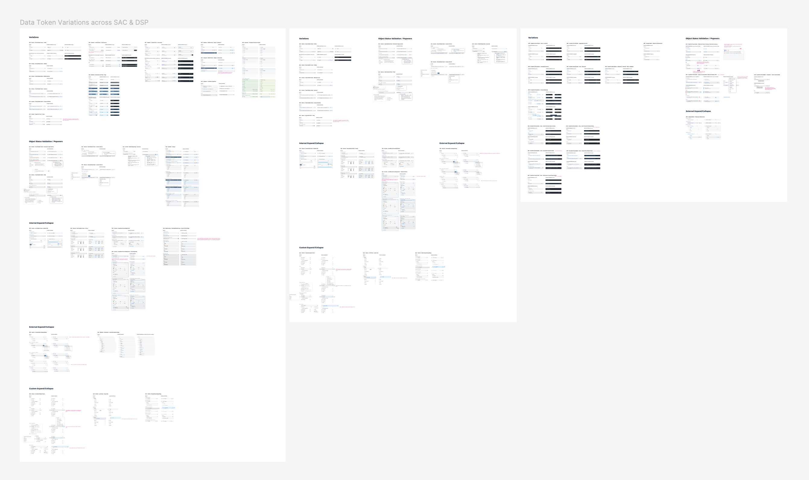
I gathered all existing implementations and worked with 10 designers across SAC and DSP to align on a unified proposal before starting new design work.
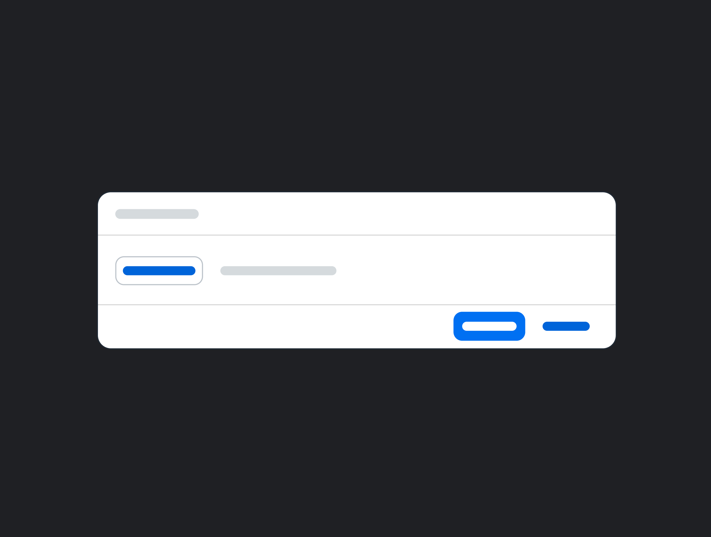
Before: How many variations could a data token possibly have?
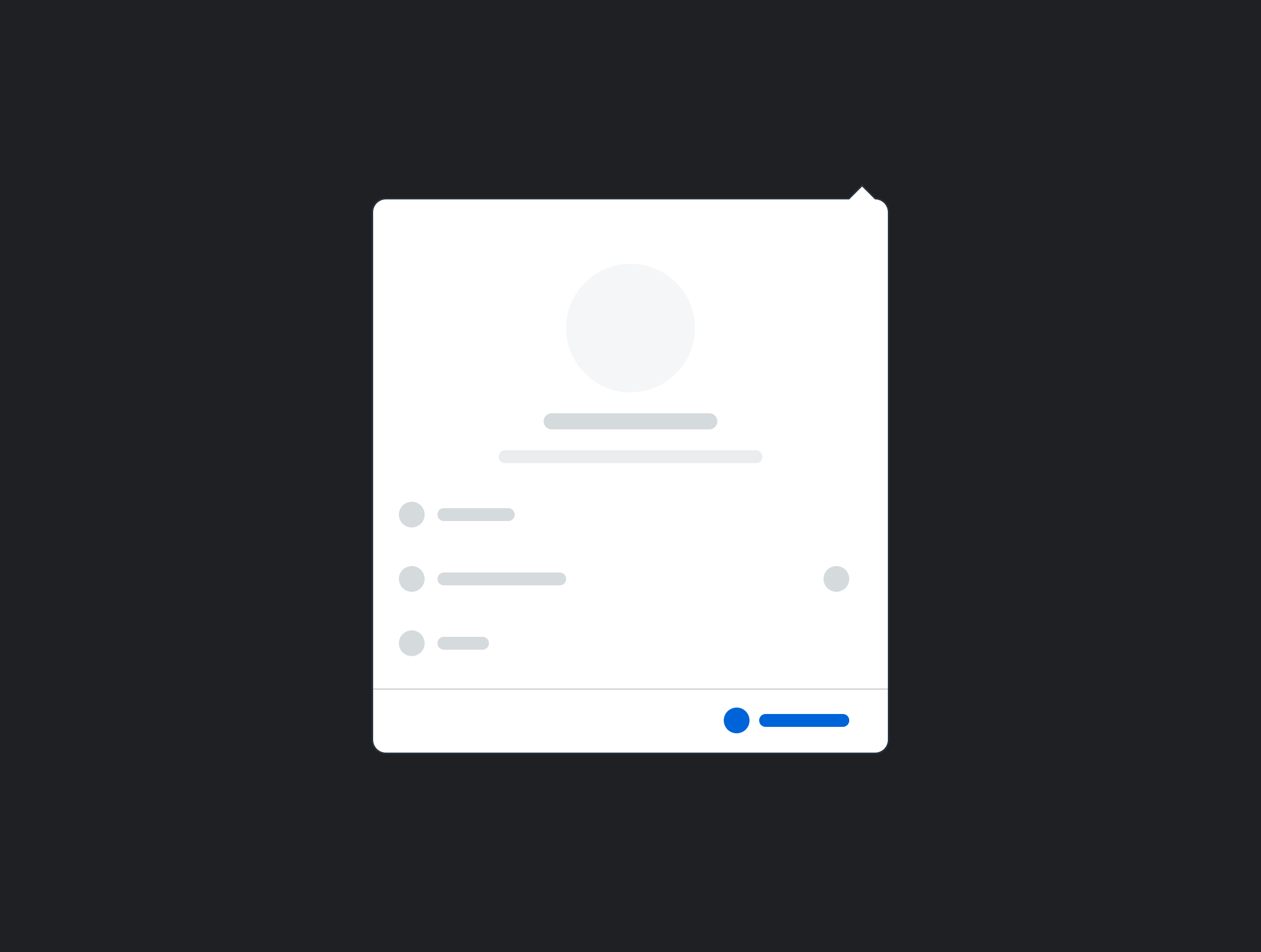
After: A consolidated proposal for SAC and DSP.
Result: An aligned design across products.
Previously, the spacing, color, and button styles varied across products. After alignment, a single unified pattern could be applied consistently across all areas.
Step 2: Building the Component
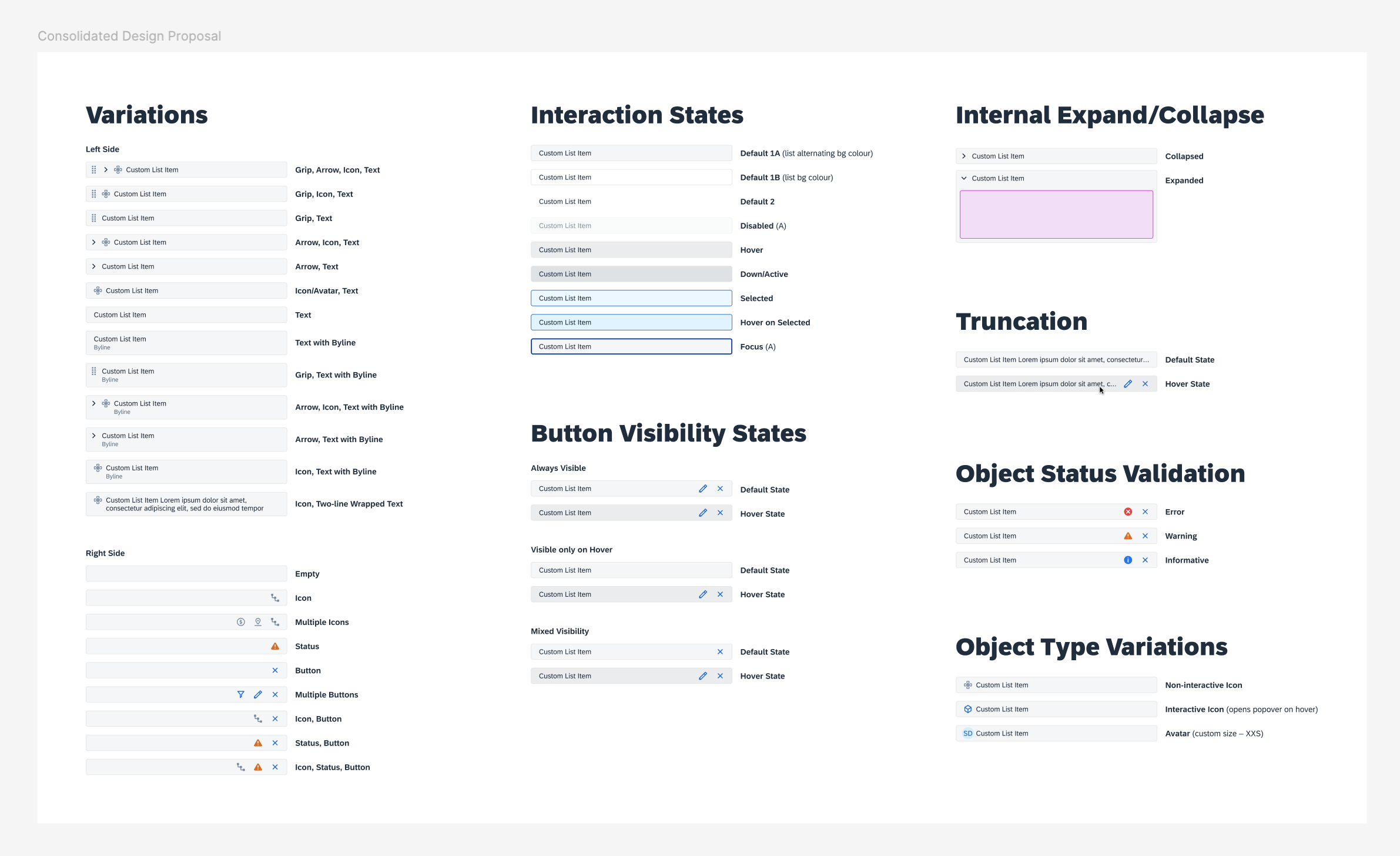
Designing for accessibility and scalability.
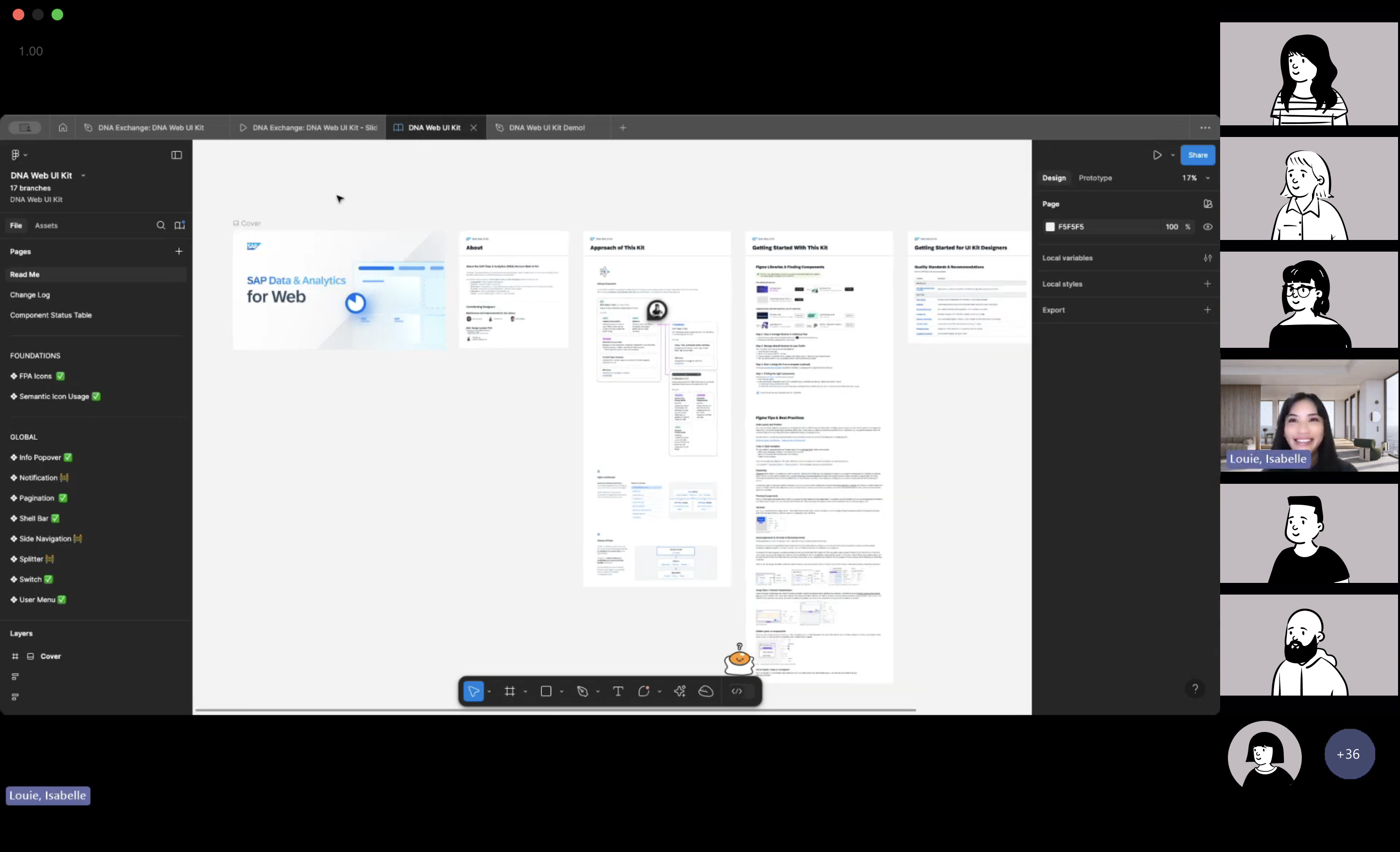
With the proposal approved by design leads, I built the Data Token in Figma, accounting for multiple variants, theming support, minimum touch targets, and keyboard navigation.
Structuring the Data Token for Flexibility (Before Figma Slots)
The Data Token supports many configurations: leading icons, trailing icons, status indicators, buttons, and combinations of these elements. The challenge was enabling that flexibility in Figma without creating an unmanageable component.
OPTION A: EXHAUSTIVE VARIANT MATRIX
One approach was to map each token configuration to a separate variant.
However, the number of variants would grow rapidly as configurations multiplied. This would
bloat the file, slow library performance, and make the component difficult to maintain.
OPTION B: NESTED SWAPPABLE INSTANCES (THIS WAS THE WAY)
Instead, I designed leading and trailing element containers that hold swappable nested instances.
Common elements are accessible through a dropdown, while designers can still use Figma’s
swap instance tool for custom elements when needed.
This structure keeps the file lightweight, preserves library performance at scale, and allows
the component to support new use cases without requiring detachment.
Step 3: Collaborating with Development
Bridging the gap between design specs and live implementation.
Working with 4 development teams, I quickly realized that understanding how engineers built components was just as important as the design itself. I reviewed their CSS library, explored the UI5 Demo Kit, and learned the variables and component structures already used in production so my specs would map directly to implementation.
Getting developer feedback early surfaced an issue I hadn’t anticipated: I was over-speccing. My annotations repeated variables and values that were already defined in the base component we were extending from. Developers interpreted those details as intentional overrides and would have hard-coded them, bypassing the default system tokens.
To avoid unnecessary custom code and keep the components future-proof as SAP’s theming system evolved, I updated our handoff approach to only specify deviations from defaults. This change simplified the specs and led to more accurate implementations across teams.
Following the work on the Data Token, I used these specs to create a handoff template, which we documented and added directly to the DNA Web UI Kit.
ROLLOUT STRATEGY
Official Launch
Introducing the Web Kit to the organization.
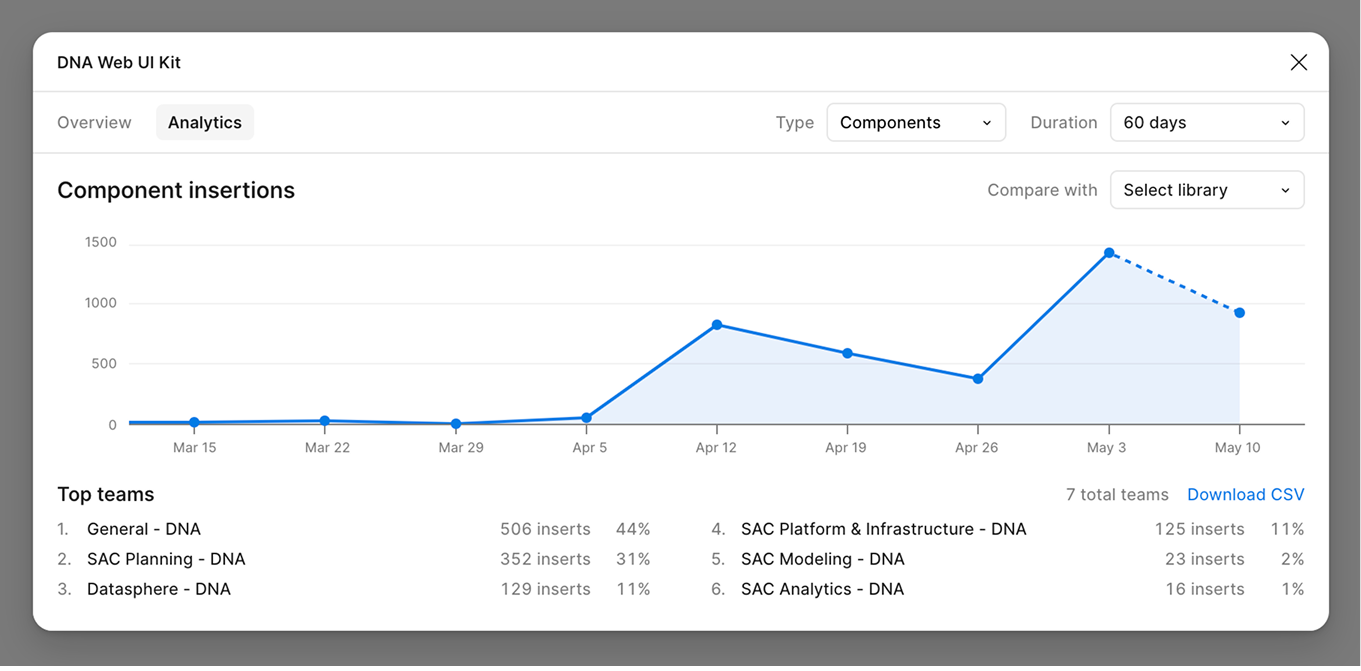
The DNA Web UI Kit launched at a global DNA Design meeting in April 2025, where I introduced the first set of components with live demos. Within three weeks, the Data Token alone had been used over 1,000 times across six teams.
Ongoing Strategy Development
How do we drive adoption and streamline communications?
The kit launched with strong momentum, but lacked the infrastructure needed to sustain adoption.
Designers needed a clear way to find updates, ask questions, and contribute improvements.
When I returned to the team full-time, I partnered with a senior design systems designer to define
the next phase of the system: a central resource hub, governance model, structured release cadence,
and dedicated communication channels.
We presented the strategy to the Head of Design and rolled it out across the organization in Q4
2025.
What's new?
DNA DESIGN SYSTEMS SHAREPOINT
A central portal for release notes, video tutorials, and FAQs.
CONTRIBUTION & GOVERNANCE
New component requests are submitted by design leads each quarter, collectively discussed, and voted on based on usage frequency and cross-product requirements.
RELEASE CADENCE
Bi-weekly releases for bug fixes and minor updates. Quarterly releases for new components and large-scale changes, with the roadmap defined each quarter alongside design stakeholders.
COMMUNICATION CHANNELS
A quarterly newsletter with each release. A dedicated Teams channel for design systems questions. Quarterly office hours open to the broader team.
IMPACT
1,000+ implementations in 3 weeks. 115,000+ in a year
Adoption that grew steadily... and kept growing.
Just three weeks after launch, the Data Token had been used over 1,000 times by designers across six teams. Within a year, it surpassed 115,000 inserts, becoming the most widely used component in the DNA Web UI Kit.
The system has since been used across 150 projects, enabling designers to reuse shared patterns rather than recreating components across products.
The strategy rollout in Q4 2025 extended that reach. The DNA Design Systems SharePoint portal received 610 total views from 111 unique designers in its first few months, with viewership up 19% in the most recent 30-day period, indicating sustained and growing engagement.
FEEDBACK
Kind words from my collaborators :)
"I appreciate your patience, focus, and ability to turn complexity into clarity while tackling the holistic big picture all the way down to the granular details. You've been an invaluable asset to this team."
— Amina Musa, Analytics UX Design Lead @ SAP
"Thank you again for your detailed mock ups and supporting us with sign offs in the Horizon theming support! We are all amazed by the fine details you spec out in the Form section header, RSS tokens and the complex (advanced) filter dialog! Truly and deeply appreciated!"
— Michelle Wong, Senior Developer @ SAP
"Amazing newsletter. Super easy to digest and very relevant for our product design team. Thanks team for putting in the extra efforts!"
— Joelle Jones, Analytics UX Design Manager @ SAP
REFLECTION
Scaling design through systems thinking
What this project taught me about people, process, and ownership.
Before this project, I assumed the majority of the work would be designing components in Figma. Instead, I found that creating the component was often the shortest part of the process. Most of the effort went into aligning stakeholders, gathering feedback, refining proposals, working with development teams across different codebases, validating implementation, and planning how the work would be rolled out and maintained over time.
Working in an organization the size of SAP gave me a new appreciation for how much collaboration goes into building a successful design system. A single Data Token proposal required alignment across 10 contributors, coordination with four development teams, and careful quality checks before it could be released. It also gave me my first opportunity to own a design system initiative from proposal through implementation, launch, and adoption. Seeing each stage firsthand reinforced that design systems are as much about enabling people and processes as they are about designing interfaces.